The Guest Bath Plan

For those who may not know, I undertook a little tile-painting last weekend.  It was my first step to giving our guest bath a full (and inexpensive) makeover to turn it from generic-builder bath….

Welcome!!!!!IMG_3324

…into something a little more “us”.    I’ll be honest, when it comes to making over rooms, I’m not much of a planner.  I usually go step-by-step making decisions as I go (and making corrections along the way).   This time around, I thought I’d give planning the ole’ college try.   I can’t guarantee that I’ll stick completely to this plan… sometimes just discovering one random item along the way can change my whole vision… but I think its a good starting point.  A good general direction.

I recently signed up for a Polyvore account and tried my hand at creating a mood board.   And here she is…

Starting at the top left and working clockwise…

First, we have two pretty light fixtures.  The reason I included two is that we currently have the galvanized steel barn light (it’s not installed yet), but I’m considering spray-painting it the lovely sage-y green color of the second fixture. (Thoughts? I’m a little nervous about this. Has anybody painted a fixture like this? Any advice?)    

Moving along, the white tile represents our newly painted tile (smiles).  And then the fun, striped shower curtain from West Elm had me at hello.  My only hesitation here is that this particular shower curtain doesn’t come in long lengths,  so I may try something similar that I could adapt (maybe a window curtain, or fabric panel) so that it just grazes the floor.

The lovely patterned rug comes next… This is just an example of what I’m looking for (this one doesn’t come small enough for our room).  Basically, I want something with a smaller scale, more organic pattern to balance the large, bold stripes and I want small pops of bright red to contrast the sagey green and neutrals.  Another option is to go for a more neutral rug (maybe a hemp or slatted wood mat) and then frame a fun fabric in a similar print for a  comparable look with slightly different elements.

The next two items simply represent our current floor tile and vanity.  Above the vanity is a simple sleek Ikea faucet that I would love to replace our more traditional faucet with.

Next… Ah, the pallet mirror.  We have a few pallets outside that I’d love to use to frame out our simple builders mirror.

Then, in the center is a potential paint color.  It’s a taupey hue with greenish undertones that I think would be a great backdrop for all of the pattern and splashes of color. I’m waiting to determine the actual shade until the light fixture is installed since the change in lighting can dramatically alter how the color appears in the room.

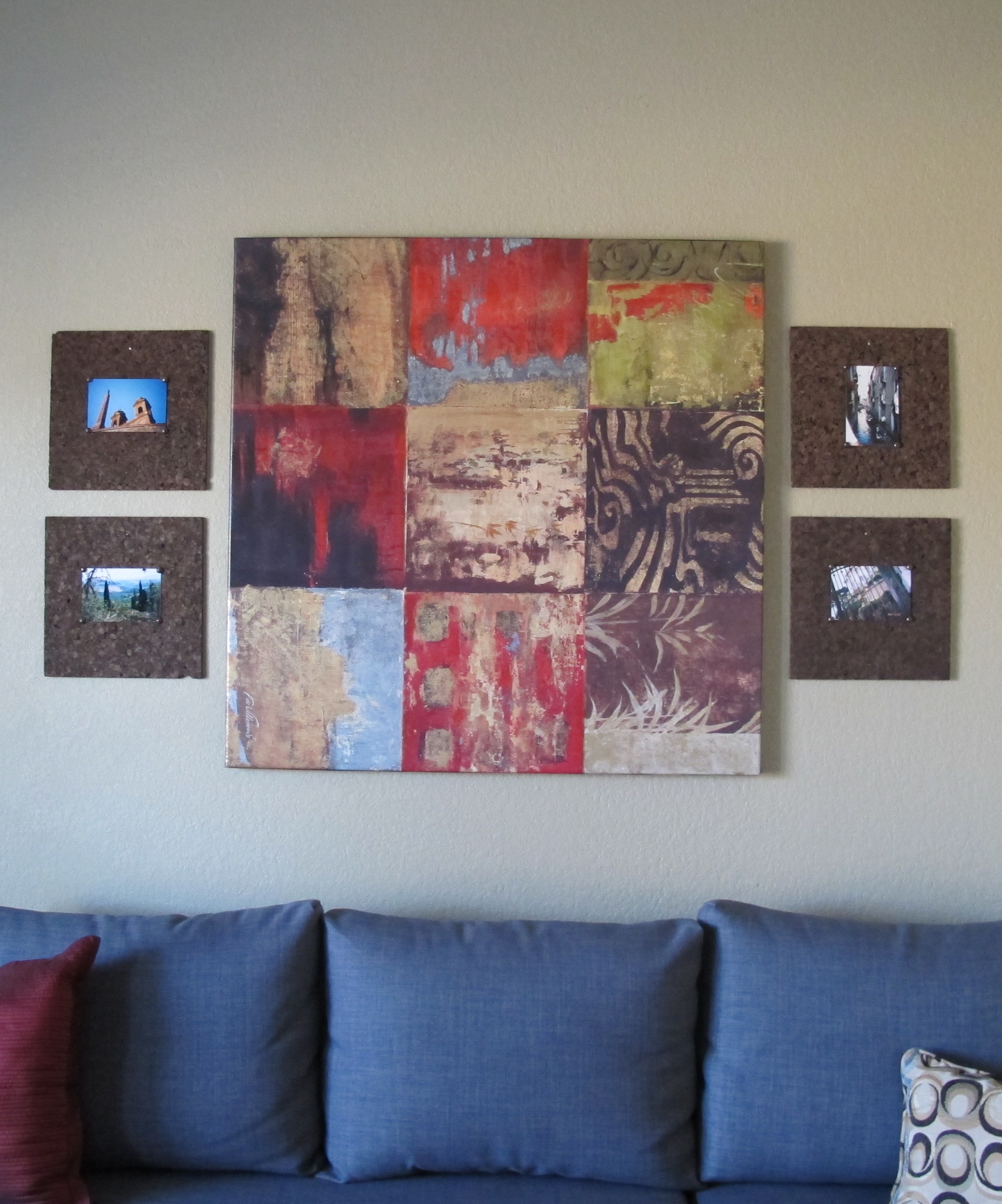
I have a few artwork ideas, but want to see how the room is coming along before I solidify them.  Also, all of the towel rods and rings are going away in favor of hooks.    Much in store for sure.   And like I mentioned before, some of this is subject to change depending on what goodies I find along the way.   And sometimes things don’t always play out the same way in person as they do on paper (‘er computer screen), so I’m going to try to be flexible if things don’t go my way at first.

So, that’s my preliminary plan.  I’m kind of excited about it, too!  Any thoughts or suggestions??  🙂

Put a cork in it

…Or on it, really.  Well, maybe I was right the first time (That’s riiiiight.  Keeeeep reeeeeading. 😉 ).   This post is about some cheap, easy art that I’ve had for many, many moons… since way back in my apartment days.  Since 2007 and my Arlington apartment, actually.  I know.  Nobody really cares.  I might in 50 years, though, when my art is still kickin’ (and I’m an 82 year old karate teacher.  Cool, eh?) .   I’ll have this blog to look back at through my inch-thick glasses to remind myself of this all-important fact.   Arlington.  2007.  Nice.  And I’ll be able to sleep soundly that night.  Which is important to maintain a proper 82-year-old round-house kick.  I mean, naturally. (P.s. Iveneverdonekaratebefore.)

…Okay, sorry.  Totally rambling here…. onto the point….

IMG_3050

So, I’m talking about the four little brown guys that surround the biggin.  Whenever someone new comes over to visit, I get comments and/or compliments on them, so I thought I’d toss it onto the ole’ bloggy blog.   This art is so easy that I actually feel guilty getting compliments.   Is that weird?  Not really.  Well, sorta.

In our last house, I hung them in a quadrant formation and they held down the fort all by themselves.   In our current house, they flank the larger painting in the front room…

IMG_3128

This art seriously cost me around 12 buckaroos.  For all four pieces.

They’re simply dark brown, chunky cork panels, which I found a while back at Hobby Lobby.  They came in a pack of four for around 12 dollars (and no, they weren’t 50% off at the time… these were purchased during my Decorating Dark Ages, when I was ignorant of the inner sale workings of such establishments.  Shame, really.).

I thought they’d make neat backgrounds for simple photos, so I chose some pics from when I went to Italy back in 2000 and attached them to the cork with some oil-rubbed bronze upholstery tacks that I had on hand.   To hang my cheapo art, I literally hammered a nail straight through the cork into the wall above my photo.  I used a level to make sure they were straight and then hammered a second nail below my pic to maintain that levelness.  You can kind of see a nailheads here (see the silver dot above the photo?)…

IMG_3125

But, if you wanted to camouflage them, all it would take is a dab with a brown marker.   I love the texture and simplicity of these pieces.   Kind of rustic, but with clean lines.   Totally my jam.  This art set is one of the few decor items that’s remained intact (without a makeover of any kind) as my taste has evolved over the years.  It’s a little unique but simple enough to fit in with many styles.  Sort of a different take on picture frames.

IMG_3124IMG_3126 IMG_3129

Also, I’ve been ecstatic about how well they’ve held up over the years.  They’ve adorned the walls of two apartments, our last house and our current house and they don’t seem the worse for wear in the slightest.   Definitely worth the moolah.

Also, cork tiles are really versatile.  Just about any art would work on them.  More colorful, fun prints for a kids room.  You could even paint initials or emblems onto them or cut out some cool letters or shapes in cardstock or scrapbook paper and adhere them to the center of the tile.  In our last house, I purchased a second, more standard-looking set of cork tiles for our office and simply stuck a clear push-pin smack-dab into the center of each tile on which I hung our extra cds (shiny-side-out).  It was functional CD storage and art at the same time.   Storage in plain sight.    So, these cork tiles are gold, really.  So many cool things can be done with them.

Have any of ya’ll utilized cork tiles in a different way?  Any ideas to share?