Painting and accessorizing the “Hang-out room”

If you imagine the color of putrid flesh, you may be reminded of our spare bedrooms…

232323232-fp83232-uqcshlukaxroqdfv8326=ot-2487=7;-=;69=XROQDF-267-787738255ot1lsi

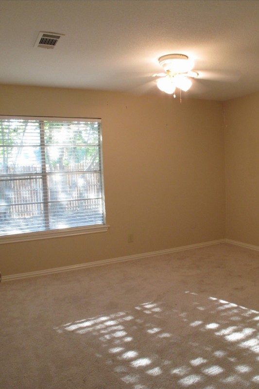
Oh, how I wish my camera would accurately convey the tone of this room.  Simply close your eyes and imagine droves of zombies a la The Walking Dead.  And then you’ll witness the exact color in all it’s rotting glory.  Do you see it?? Isn’t it wretched???

To make matters worse, the doorway of our hangout room is all that you see as you walk down our main hallway.   It’s directly at the end.  The focal point, if you will.  And for three long months, I gritted my teeth every time I walked past.

Here is the space the last time I showed it to you.  We’d changed out the carpet and window and simply plopped down our stuff….

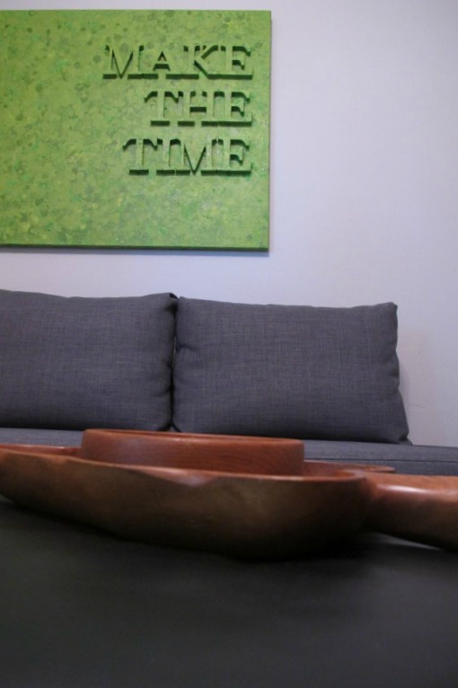
And now the room looks like this….

Improvement, no?

We still  have a ways to go.  I need to accessorize more to add warmth and softness, add a round mirror to the wall next to the window, new coffee table eventually, more couch pillows, floor pillows, etc.  But, at least it’s no longer reminiscent of the un-dead.

The soft grey color was actually an attempt to color-match the grey paint that runs throughout the main areas of the house.  It came out close… but not close enough to act as touch-up paint for the existing color, unfortunately.   So, I decided that rather than waste that gallon of paint, I’d simply use it in this room.  Since it’ll act as another common space (when it’s not a guest room), I thought that extending the main house color into this space would be a nice transition.

Here are a few messy progress shots (Aka: the time Lucas Michelangelo photobombed).  First of the painting…

Then, of the curtain hanging…

You may recognize these curtains as the flanking shower curtains from our last house.   The height, pattern, and color work PERFECTLY in this space.   I pretty much jumped around in excitement for the first few days after hanging them.   And the thing is… I simply used the same shower curtain rings from our previous bathroom to hang them.  Even though they’re stainless steel, thus, don’t match the oil-rubbed bronze rod, they look super cool and sleek.   I initially thought that I’d use them as a placeholder until I found something new, but they’re staying.   Because I love them.  And they’re awesome.  I guess you never know until you try.

Here’s another shot after I hung the painting…

This painting is another piece of art created by my mother-in-law Mac.  It was displayed in the master bedroom of our last house. To create this piece, she glued foam letters onto the canvas, painted it green, then went crazy splatter painting it in other various tones of green.   So super cool.

232323232-fp83232-uqcshlukaxroqdfv39-37-nu=3396-6-9--78-WSNRCG=35;488-378346nu0mrj

We still have this blank wall, which is where we’re putting the TV.   I’ll have another post for that.

Let’s zoom in, though, to that lovely intercom.  It initially looked like this…

It was yellowed, dirty, and tacky gold.   I mean, I love gold but let’s face it… there’s good gold and then there’s tacky gold.  And this was pretty darn fugly.   I solved the problem by cleaning it off and then applying a few thin coats of wall paint…

Now, it blends in and is much less offensive.   And one more glamour shot for the road….

I love how my painstakingly refinished mid-century table looks in this room.   It adds serious character and richness.  Worth every frustrating moment if you ask me.   I simply swapped out the lamp from Lucas’s room and it fits perfectly in the space.  It adds some curvy contrast to all the straight lines going on.

I have to say that I’m really happy with the direction that this room is headed.   I have a few fun projects in store for the space, and once we get my mid-century media stand situated, I’ll have another update for the TV portion of this space.

So, stay tuned… 🙂

TDC Before and After

DIY Large Scale Italy Art

You guys. This is totally happening right now…


IMG_3557.JPG

IMG_3558.JPG

After a week or so of freezing our petoochies off to the tune of freezing weather, our paper-thin windows are getting replaced!!! I read somewhere (where was that??!) the description of 1970s windows as follows “If you lean your head close enough to the window pane you can feel your hair blowing in the breeze”. Very true. True statement right there folks. So, we are more than thrilled to be crossing this task off of our to-do list. Anyways, while that’s getting done, I thought I’d tell you about our new DIY artwork.

Remember when I painted our master bedroom?  I mentioned that I wanted to change up the feeling of the room with different modern/quirky art??   Well, I found one that suits us to a T.   Ya see, I was just minding my own business, checking out Pinterest, when I came across this pin….

IMG_2477.PNG

Now, I’m not much of a wordy decor person (Wait. Rephrase… I’m wordy.  I just don’t often gravitate towards word ART.  Boom!  Nailed it.), but this quote resonated with me.   I’m 75% Italian.  My grandparents on my dad’s side immigrated from Italy when my Aunt was a baby, so I grew up listening to them speak Italian and hearing stories about the small village where they hailed from.   When I graduated from high school, my Aunt Sera took me to Italy and it was everything (plus more) that I hoped it would be.   It was stunningly beautiful, as were the people.  Not.Kidding.  Seriously, we were amazed that there were no ugly Italians to be found.  The less attractive folks all seemed to be tourists.  Heehee!  Anyhoo, the beauty of the country was rivaled only by the incredible food.   Good gravy.  I would move there for the food alone.  I still dream about the potato and vegetable soup I had in Venice.  Twice.  And don’t even get me started on the gelato.  I ate it at LEAST daily throughout our trip.  So, when I came across this pin, I just knew that it was right.  And the simple, modern style was fantastic!

I followed the pin to the source which lead to this blog post on Brittany Makes.   Brittany actually created the art in Photoshop and had it printed at Kinkos in her preferred size (29.5″x 39.25″ per the largest Ikea Ribba frame).  And much to my delight, she offered it up to her readers as a FREE printable!!   Since her post was published, Kinkos in our area had transformed to the Fed Ex print/copy shop and for a higher quality print, they quoted me around $90.   Not in the budget.   AND they didn’t offer the exact size I needed anyways (I’d followed her lead and purchased the same Ikea Ribba frame).   After doing a bit of research, I found that I could have the good folks at Staples produce an engineering print for around $8 in 36 x 48″ size, which I could then cut down to fit my frame.   (If you do this, be sure that the box that states “Fit print to Frame” is unchecked, otherwise the art will be too large to cut down).

Once I got my frame home, I simply laid the frame’s plexi-glass over my print, traced around it and cut it down with scissors.

Now, here’s the deal with engineering prints… The paper is super thin, so you must back it with solid white paper so that you cant see through it.   Unfortunately, the paper that came with the frame had printing on it…

So, I just scotch taped computer paper to both the cardboard frame backing and the opening in the matting….

I secured the frame and hung my new art on the wall only to realize that the flimsiness of the paper caused it to wrinkle beneath the plexi with the pull of gravity….

So, I removed it.  I thought about adhering the print to the frame’s backing with spray adhesive, but I was afraid that the adhesive would stain the thin, white paper.  In the end, I ended up taping the print to the matting with more Scotch tape to prevent any further drooping. This helped a lot, but just keep in mind… this is why such a large print is $8.   I’m okay with imperfection due to that.   But if it really bothers you, you may wanna spring for a higher quality print.    In any case, my new Italy art is hung and she’s a beaut (albeit somewhat hard to photograph due to it’s reflectiveness)…


It adds a pop of modern sleekness to the bedroom which compliments the lines of my mid-century ottoman and painted wicker chair.   This is exactly in line with the direction I want our bedroom to go.  Personal but modern.  And also, ignore the conflicting brown tones.  I’ll get there.  Eventually… 🙂

TDC Before and After