Remember that part in the movie when Glinda the Good Witch tells Dorothy that she had the power all along? Well, as suggested by the title of this post, I totally feel like that. Reason? All of my bathroom tweaks this week were free. Everything that I needed was already here, residing in our house this whole time. I simply wasn’t utilizing them to their full potential.
Some of you may remember that my newfound wave of bathroom inspiration started with me tearing out our side-splash. And now we’re moving on to the toilet area. Last we looked, the area above the toilet looked like this…
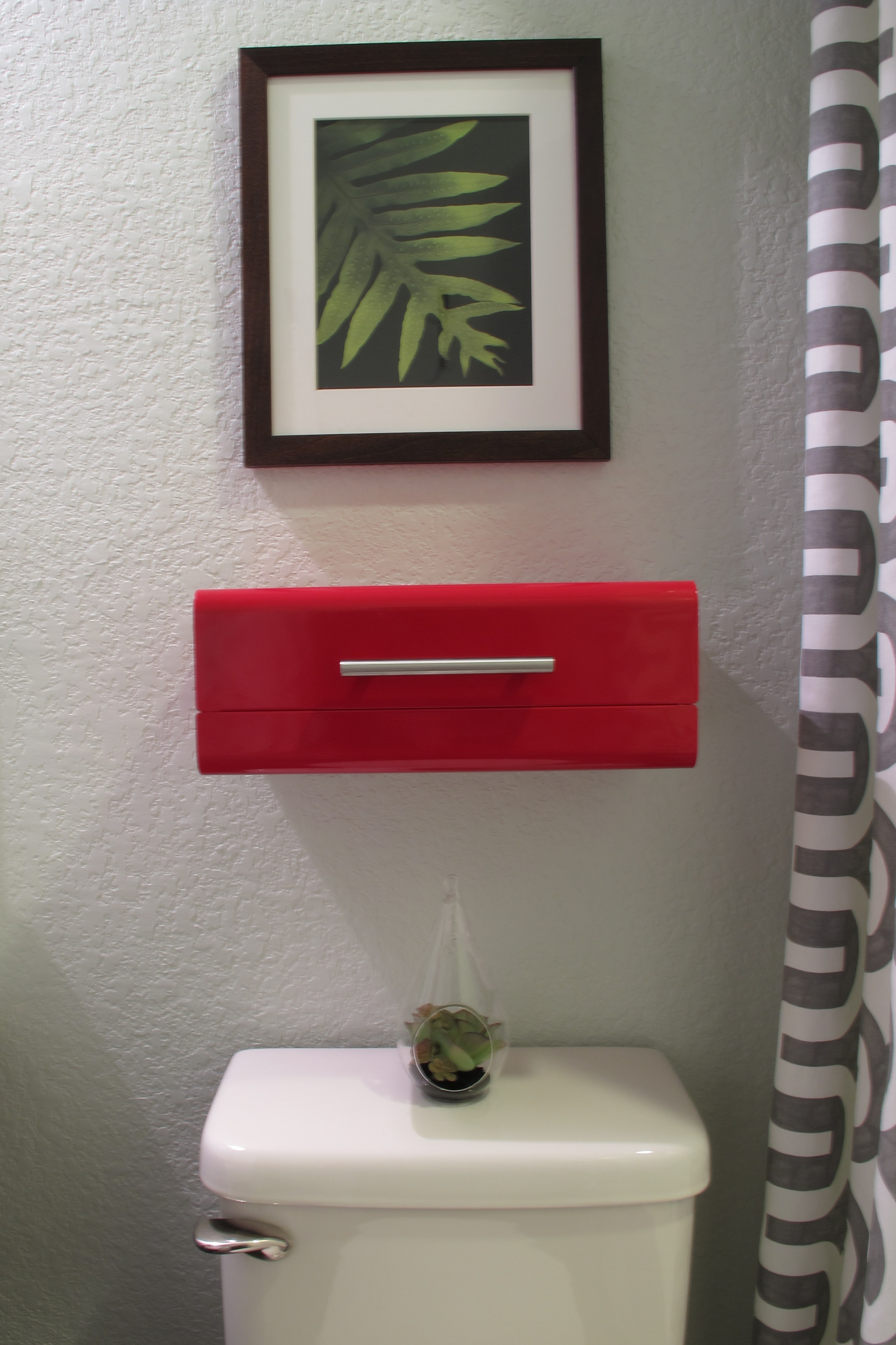
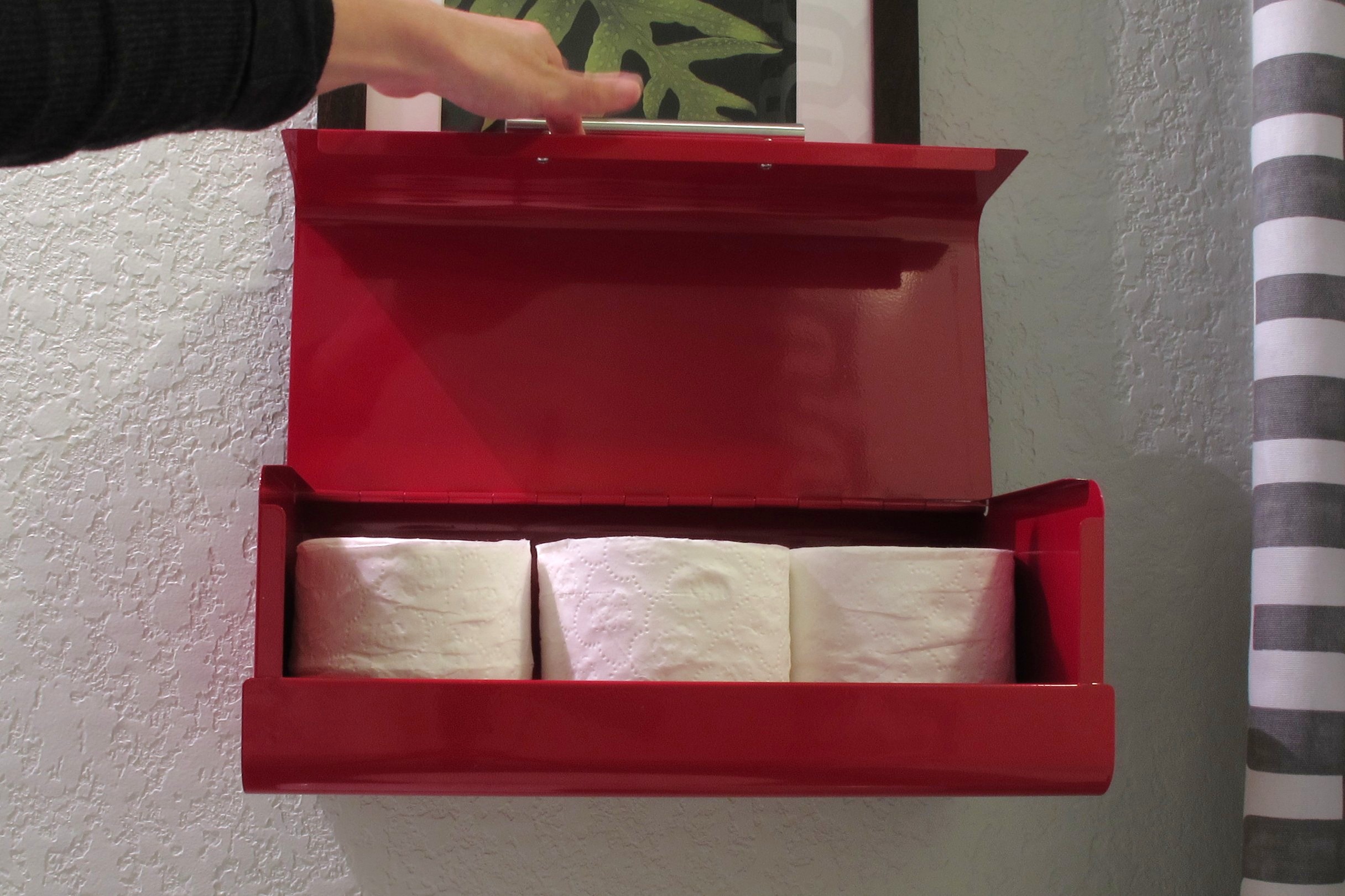
Don’t get me wrong… in my opinion, it was a vast improvement from the builder-basic-blank-slate it started from, but it still wasn’t quite there. My favorite part of the room is definitely the red breadbox-turned-toilet-paper-storage (of which I still owe you a tutorial), but from this view it felt kind of like a random box screwed to the wall…

It needed to be accessorized. Grounded, if you will. Obviously, I didn’t want to put anything on top since that’s how it opens…
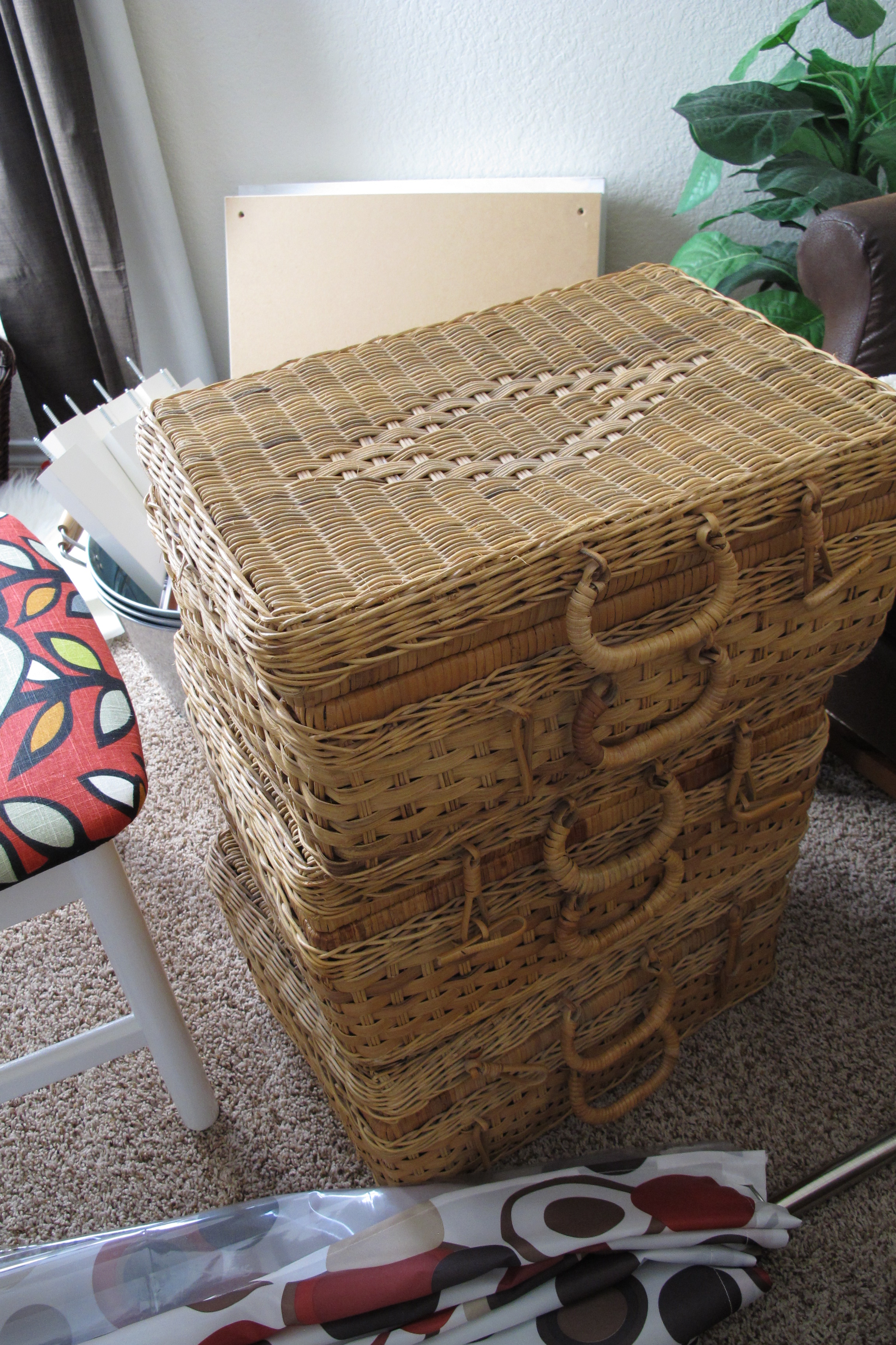
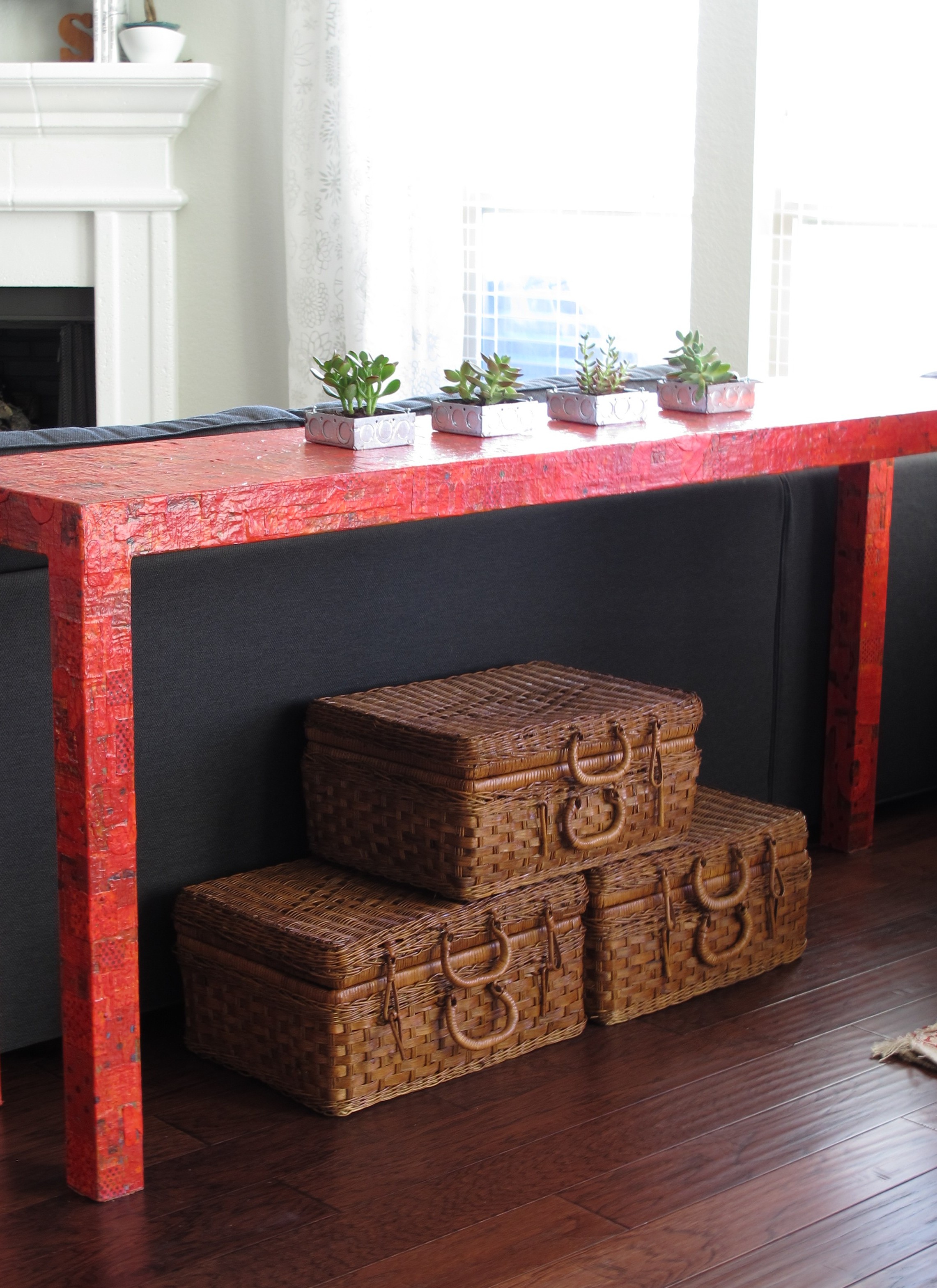
But, below was just screaming for some love. So, I went through my stash o’ stuff and came up with this basket….

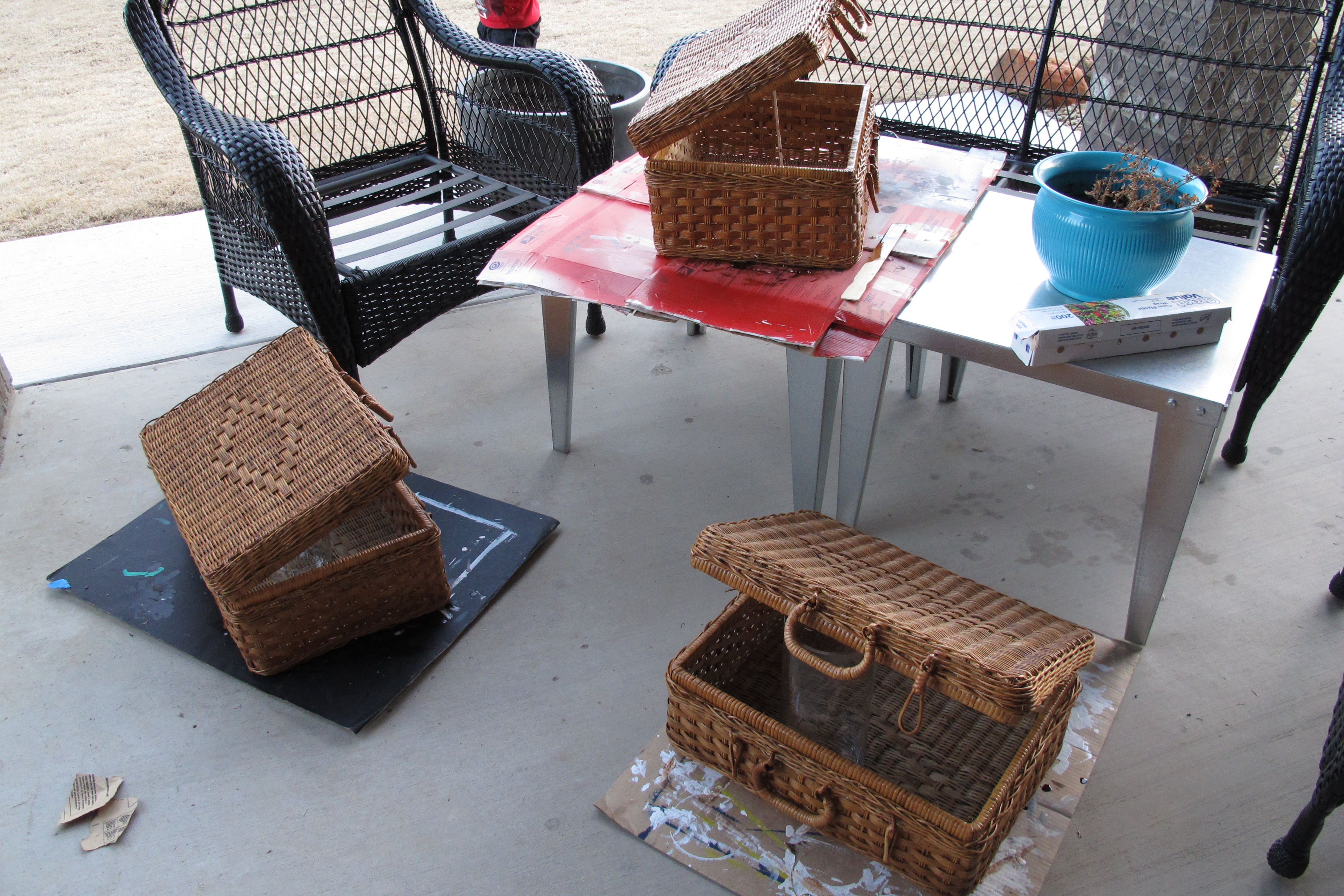
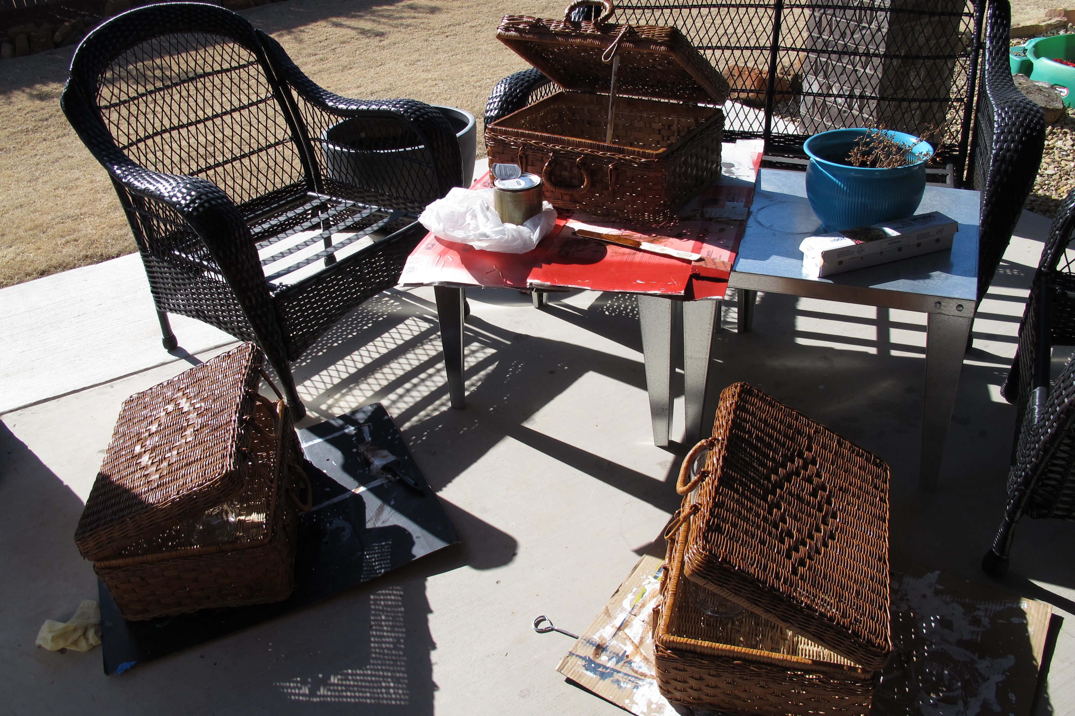
The gold tone of the bamboo clashed with the rest of the room, so I gave it the ole’ oil-rubbed bronze spray paint treatment.
A few towels later and here we go….

You can see that I also changed out the artwork. This is the Lerkil picture from Ikea. I’d purchased it several months ago for a different project (which I hadn’t gotten around to), but thought I’d give it a try in this room. It’s simple and graphic and most importantly, the right scale for the space. It’s tall and slim and the thickness of the canvas (3 1/4″!) helps blend the depth of the breadbox so it doesn’t seem to protrude quite as oddly…


BAM! Breadbox is blended.
To me, it now looks like it belongs. And as much as I liked the pop of green from the previous artwork, I’m really digging the more muted color scheme with simple pops of red and aqua. I’ll admit… I’m considering repainting the room with a slightly brighter aqua paint, but I haven’t fully decided yet. It needs to marinate a bit more in my head.
In any case, I’m really happy with the direction this room is going. Especially since we started here…


If you’re new and would like to catch up on the rest of our bathroom makeover, here are the links:
- Painting our bath tile surround
- Hanging a barn light
- Framing and white-washing our mirror
- Painting the room (Ante Meridian by Valspar)
- DIYing extra long shower curtains
- Adapting a shower liner for flanking curtains
- Techniques for installing hooks, toilet paper dispenser, basket rod
- Swapping out an ugly toilet handle
- Reveal
- Removing our side-splash
Anyways, I’ve got one more post in store for this week with yet another tweak. So, come back and join the fun! 🙂