Sometimes my Type A personality is a tough thing to get past. I’m a detail person. Details must mesh with one another, especially when it has to do with a project that I’ve worked on myself. And when a project feels half-done (or like it doesn’t flow) I can’t think of much else besides fixing it until it’s actually complete. Which explains why our master bath has been a huge mental pain in my arse for the past 5 months. My Type-A-Ness has been hitting the crazy-meter. And no, it’s not because it’s ugly. That’s a fact that I accepted when we bought the house. It’s a detail thing. A paint detail thing to be exact.
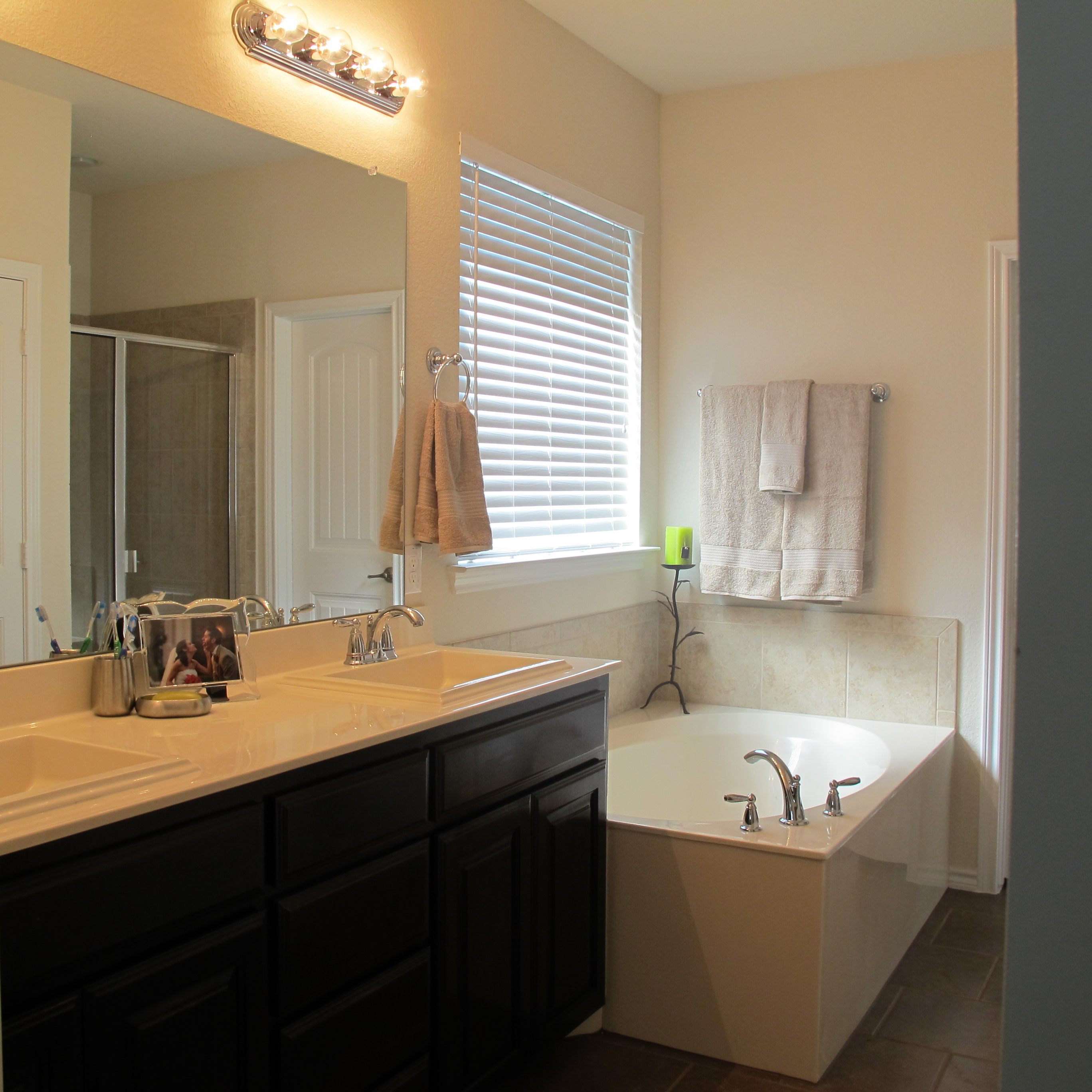
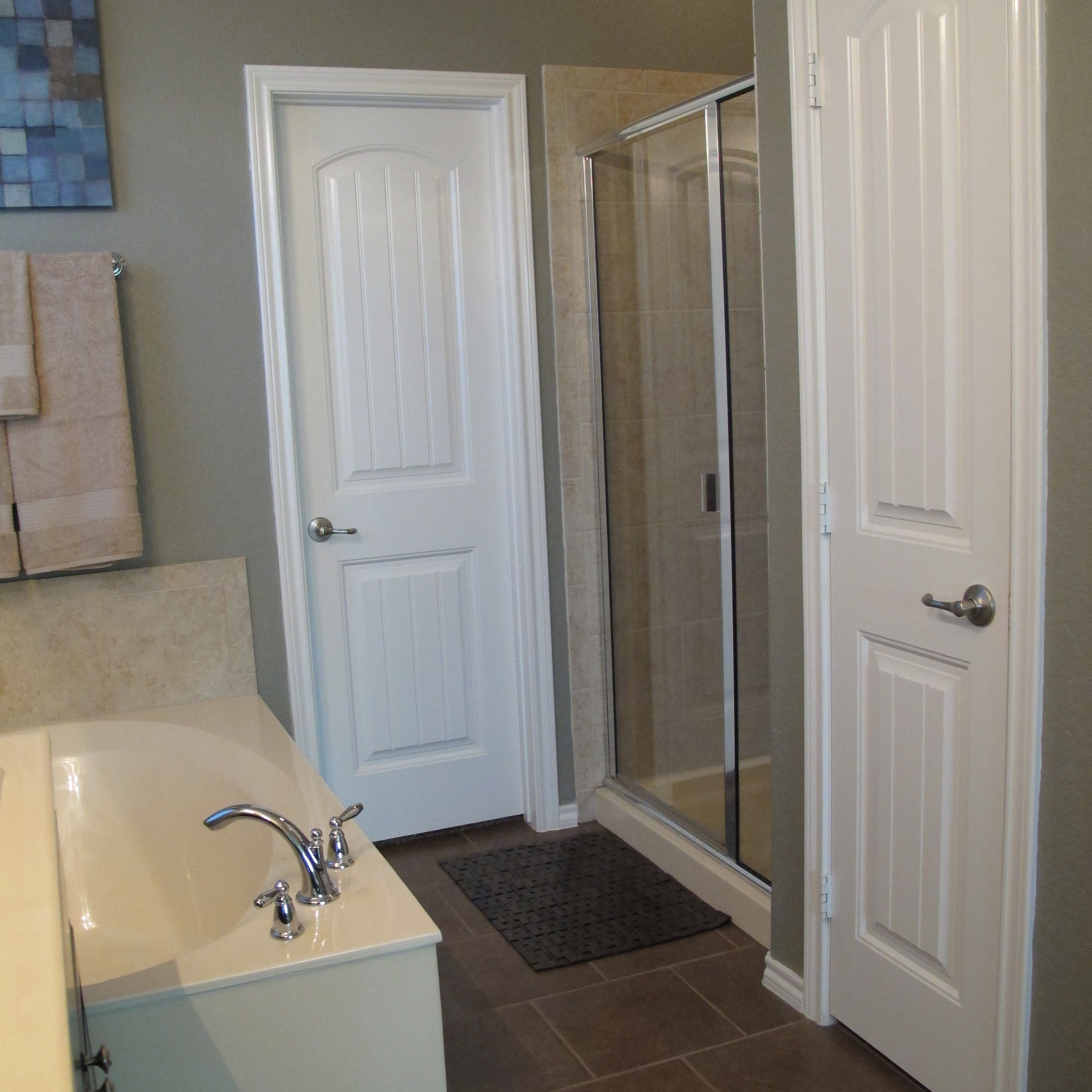
Just in case you haven’t seen our master bathroom, allow me to introduce you (prepareyourself)…
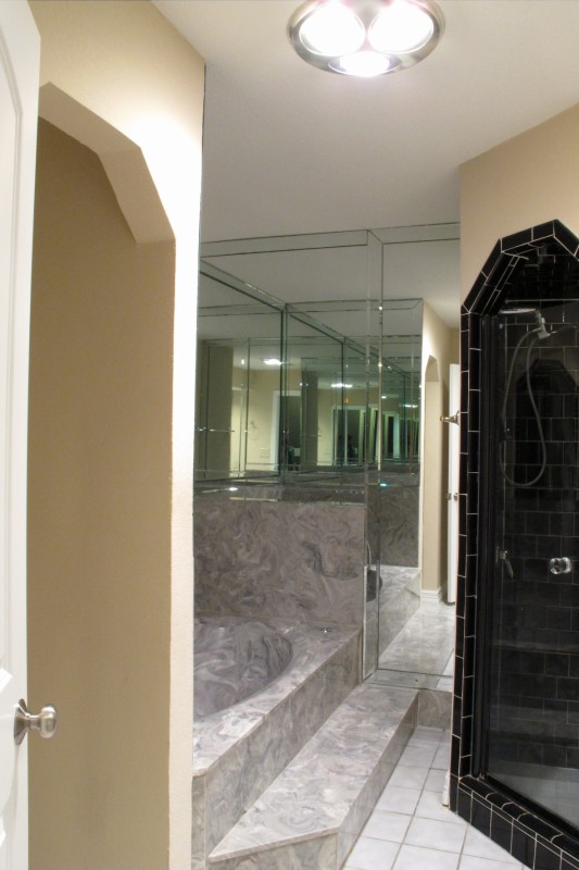
This room is decked out with navy blue and purple cultured marble (with swirls of mauve… we must not forget the mauve), 80’s floor tile with stained grout, peach walls, and what I like to refer to as our “coffin-shower”. I mean, just tell me that doesn’t look like I’m buried alive…

Not to mention the cramped, poorly thought-out layout with zero natural light. It’s quite the gem, really.
Honestly, nothing short of a full gut is going to save this room. We know this. So, the only things that I could think to do to freshen it up as we save for a complete renovation was to give it a good scrubbing and paint those awful peach walls.
And my color of choice was white. It was really the only option. I refused to give that terrible marble the satisfaction of trying to match it in any way.
My goal was to match the trim paint but use an eggshell finish (as opposed to the semi-gloss that was on the trim). Since we didn’t have any trim paint on hand, I basically just held up a bunch of color swatches to the trim and ended up with Behr Ultra Pure White 1750, which according to the swatch I had was a nice true white. Not too bright and blue, not too yellow. Just nice. Or so I thought.
Now, here’s where things got a little hairy. As I just mentioned, the color I was going for was a soft creamy white. But the color I was painting appeared to be brighter… more blue. I figured that it just needed to dry, so I gave it a chance. But after spending all day painting (it took three coats… yeah, not super impressed with Behr’s coverage in this case), I stepped back and realized that the paint was definitely more blue. And that blueness was making our trim appear yellow in comparison. Ugh. Not good. And then I held up my color swatch…. Yup. Wrong.Friggin.Color. You’d think I was crazy if I showed you the photo I took to demonstrate this. It just didn’t capture the difference as it was in person.
Now, did the paint color look completely terrible? Not completely. Did it look better than the peach? Most definitely. Some may be able to look past it, but I’m an undertone person. Colors either need to intentionally contrast or match exactly. The almost-matches-but-not-really thing is NOT cool with me.
So, I purchased new paint, this time emphasizing that the color needed to match the swatch exactly.
And time passed.
And nothing happened.
*coughcough* I probably should mention that the painting of the bathroom happened in OCTOBER. I even alluded to it in this post back when I painted our bedroom. I just didn’t want to post about the master bath until I got it repainted again.
But then, the repainting didn’t happen. And it kept not happening. For a long time. And then I realized something….
NOTHING will make this room look good shy of a full gut. (pause. rinse. and repeat) Nothing.will.make.this.room.look.good.shy.of.a.full.gut.
I mean, I know this. I’ve KNOWN this… So, after this statement bounced around my head for, like, 5 months I finally had a break-through: If nothing will make this space look good, then why am I stressing over a slightly different shade of white??? Lame, Christina. Totally lame. I guess sometimes it just takes time to realize that you need to step back and look at the big picture, ya know?? And I finally did. I weighed the amount of time and energy I’d spend repainting this hole (and mind you, it’s not a fun hole to paint thanks to all those ridiculous nooks and crannies. (Heehee! Gross.)) versus the reward (slightly different white paint), and I just.said.NO. Now, don’t get me wrong… If this were the final space, I’d totally do it. But really, this bathroom is gonna be ugly no matter what color white it is. So, we’re gonna rock it as is for a while.
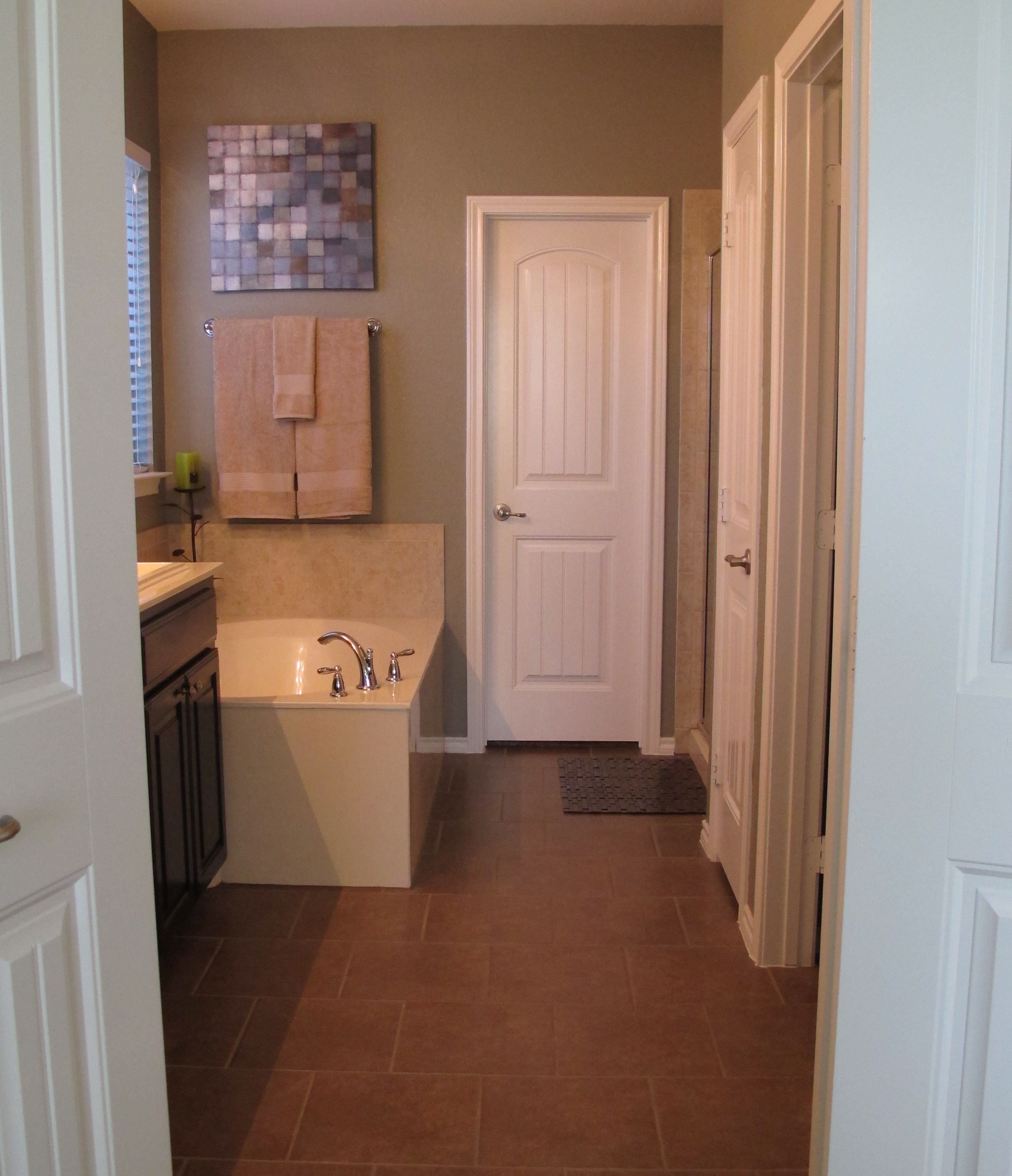
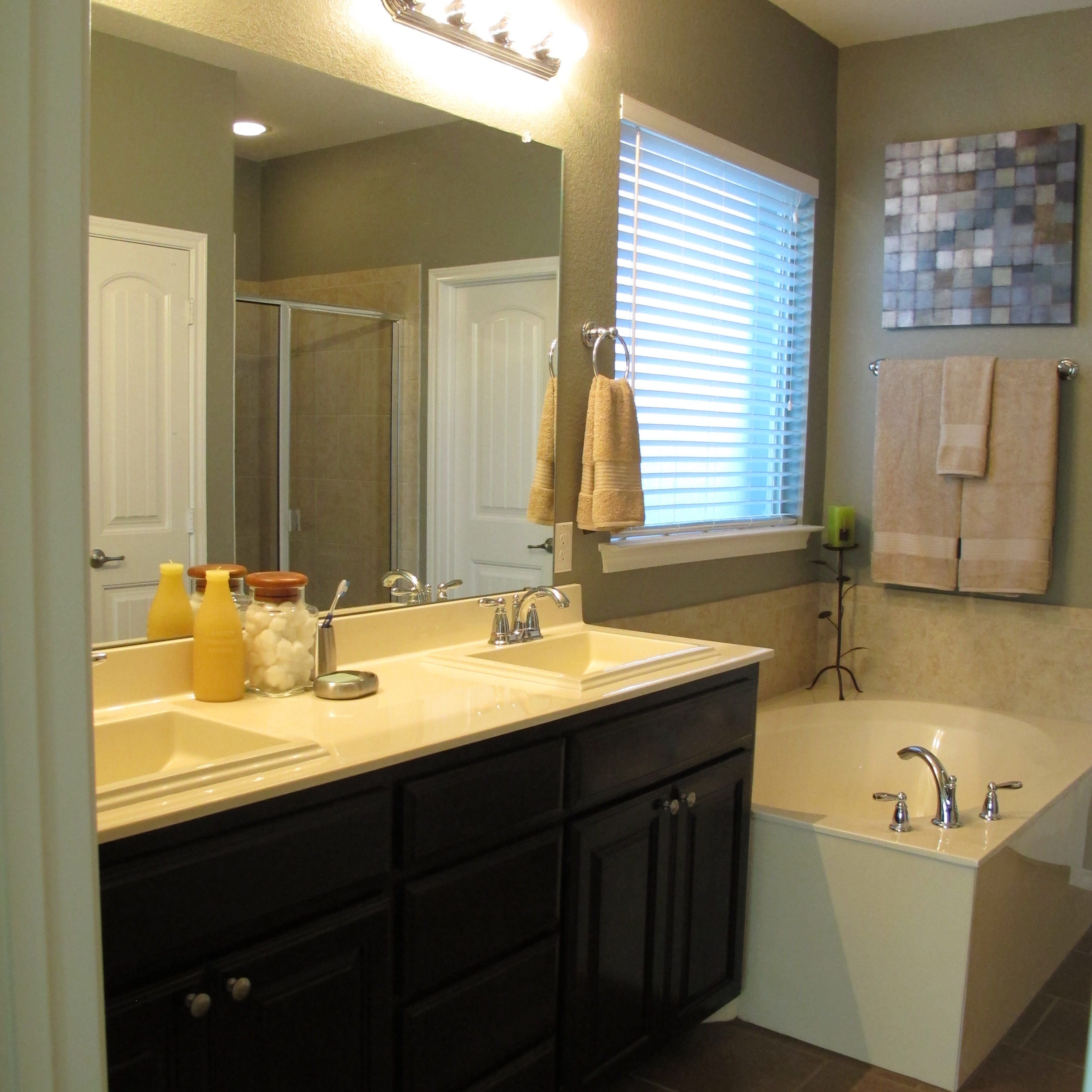
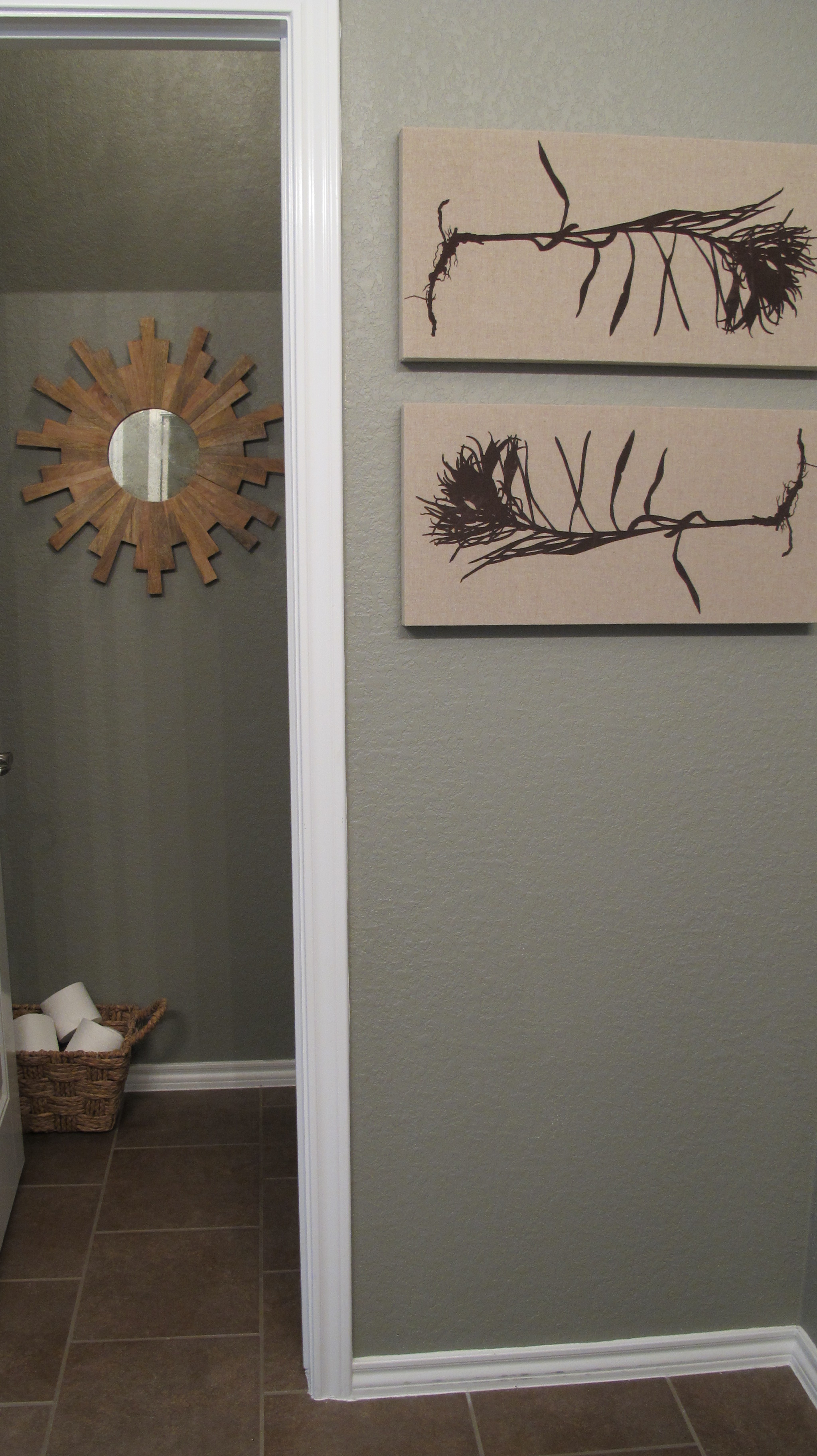
Here’s how it looks now…


Remember how I discussed the difference light bulbs can make on a paint color? The above picture is a prime example of how a light bulb can make a space seem yellow. That’s a quick switch that I’ll probably make at some point.
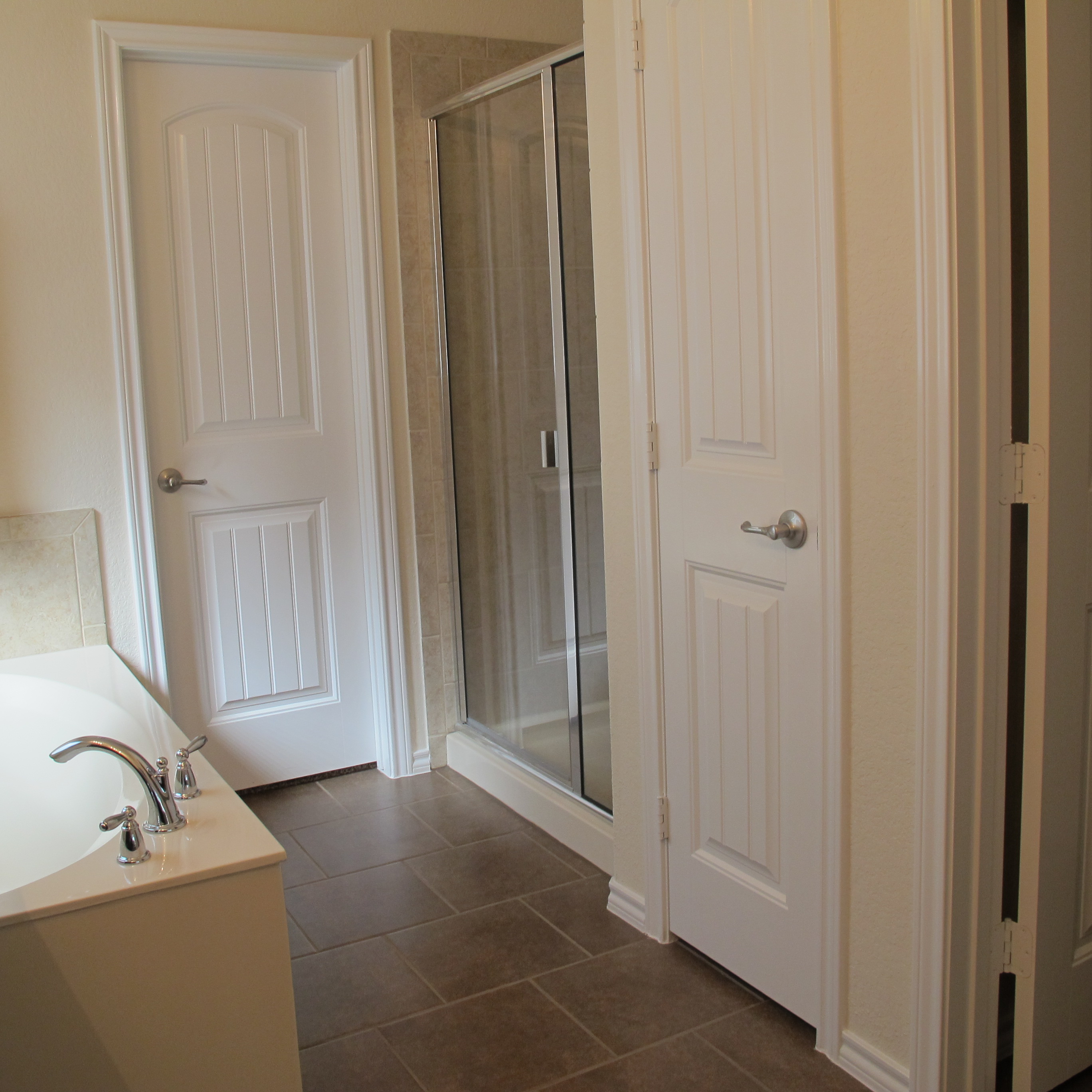
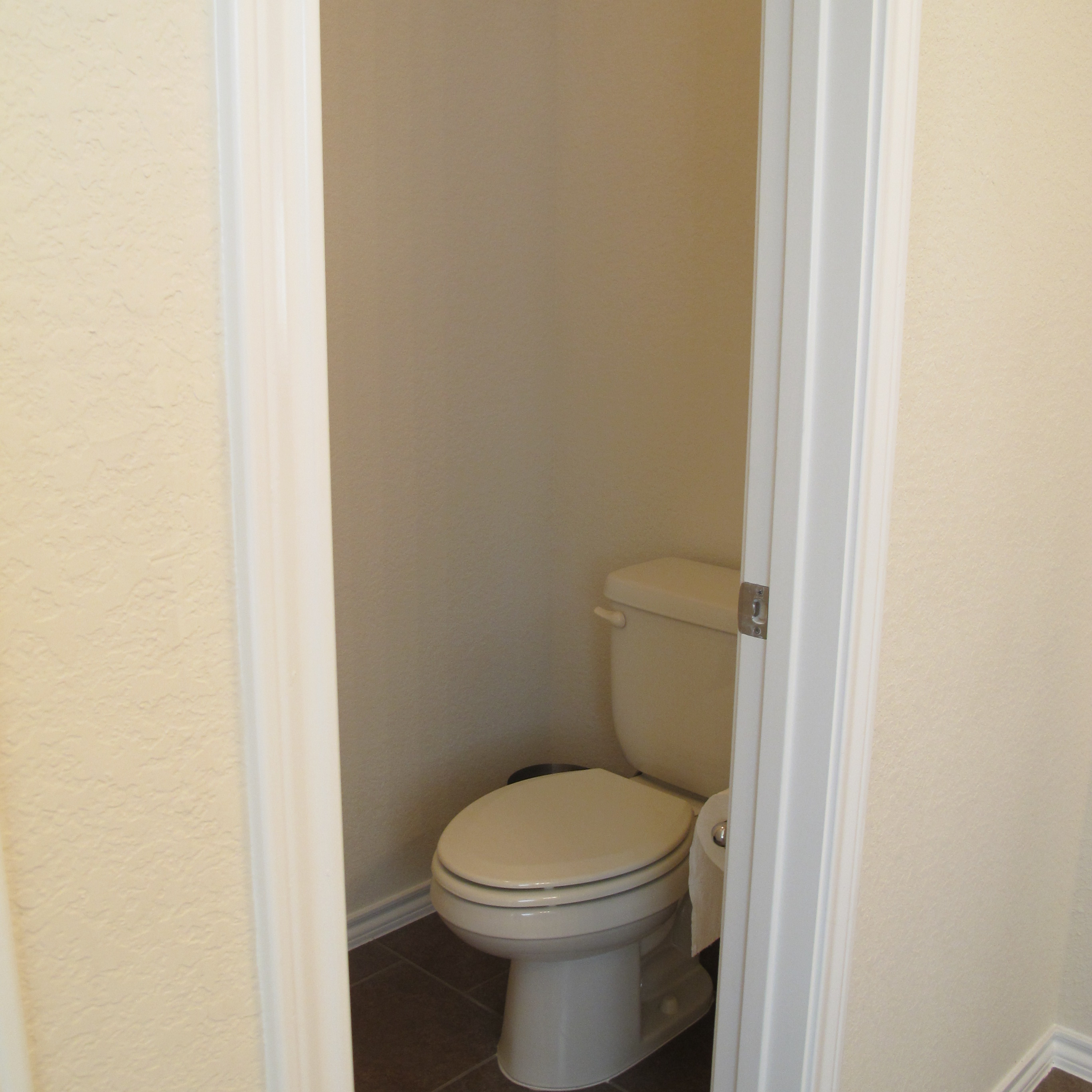
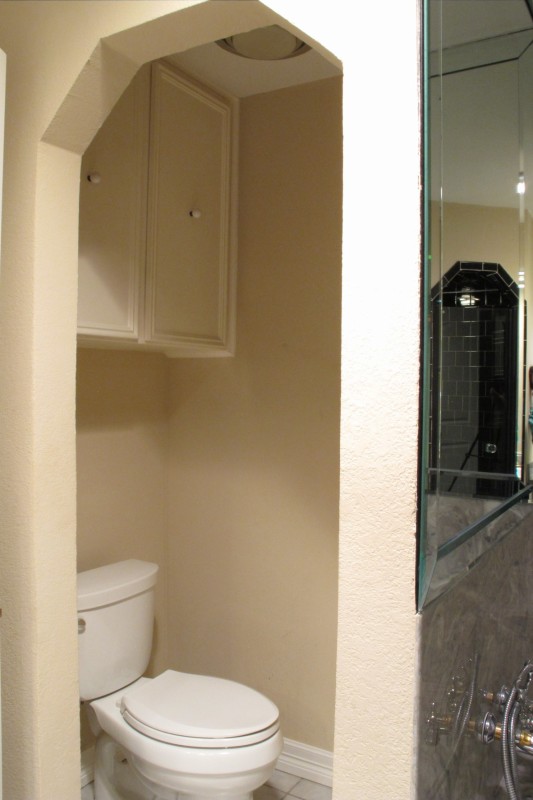
You can also see in the pic below that the coffin-shape of the black-shower-of-doom is replicated in our toilet area (…you can even see the shower in the mirror’s reflection! Nice touch, right? Haha!) …

I’m just imagining someone in the 1970’s wearing bell-bottoms and a a large-collared shirt, planning this bathroom, and thinking how clever and groovy it was to carry the coffin-shape throughout the space. Heehee! And ya know what?? I just realized that our bathtub (which is oddly vortex-like)…

Is reminiscent of something else…
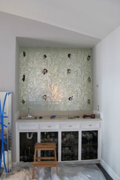
Remember that wallpaper that we found behind our wet-bar mirror?? And instead of peach walls (like in the bathroom), they had peach countertops! Way to tie it all together. This house must’ve been the place to boogie in its heyday. 😉
So, anyways, that’s the master bathroom. I have a hard time seeing us doing anything else to it until it’s renovation time (aside from a bit of accessorizing and some hardcore grout-cleaning). The awkward layout and the fact that both the shower and bath tub plumbing fixtures are set on the weird partition walls rather than exterior walls…

And the fact that the step that leads to the bathtub (??) was tiled around and grouted in (as seen three pics up), mean that only major changes will make a difference in this room. If the plumbing was placed differently, we could at least take down some of the partition walls to open up the space. But we can’t. So, we wait. I’m excited to someday take a sledge hammer to this joint (given that I can actually LIFT said sledge hammer… I might just kick the walls a lot instead. Heehee!). 🙂
In the meantime, I’m (well WE’RE — Joey’s hatred of this bathroom is as vast as my own) daydreaming of adding a solar tube for natural light, a HUGE glass-enclosed shower with gorgeous tile, maybe a clawfoot tub, and completely reconfiguring the space so that it makes more sense. It’s actually a pretty large bathroom… The space is just used so inefficiently (and the tub is so massive) that it seems small. This project will literally be a gut down to the studs once we’re able to do it. And we wanna do it right, so it may take a bit of time to save enough, but we’ll get ‘er done eventually.
So, tell me… what’s your favorite part of the space? The coffin-shower? The vortex tub? Any design ideas or suggestions? Anybody been through a full gut of this magnitude? Any tips or tricks?