Aka: The heart of our home.
Many people say the kitchen is the heart, but for us, it’s the living room. It’s where we spend the bulk of our time. It’s where the kiddos play. It’s where the adults wind down. Many a robot dance-a-thon have occurred here. It’s where Batman and SuperBaby roam. It’s our home’s mothership.
Now, I’m gonna be real… this is the living room cleaned up to the nines. Most of the time, there’s a pile of toys just to the right of the television (which often extends… everywhere.). It gets cleaned up at night, since I find it hard to have adult time when ankle-deep in toddler toys. And, on those rare occasions where the kiddos are out of the house and we get a good grown-up day, the room reverts back to this. So, let’s just say that the living room is donning it’s little black dress in these pics, all cleaned up and ready for adult time. 😉
When we first moved in, our living room was a blank slate…
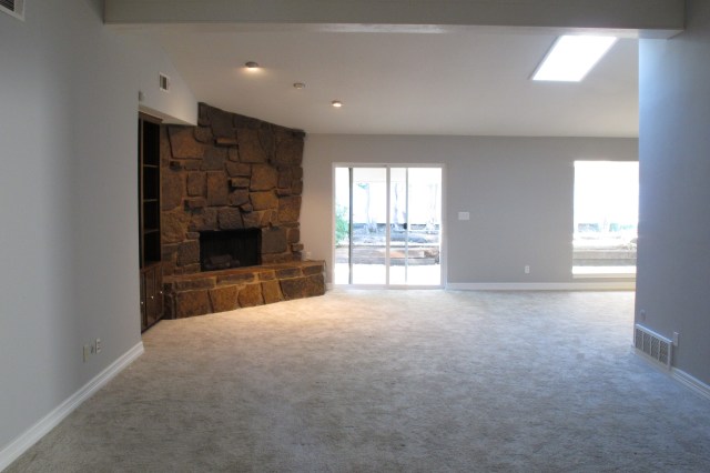

I walked into it for the very first time during our initial showing and just KNEW. This was it. The vaulted ceiling and stone fireplace had just the character we were looking for, and the view out of the large picture window and sliding doors along the back wall was so quaint and homey…
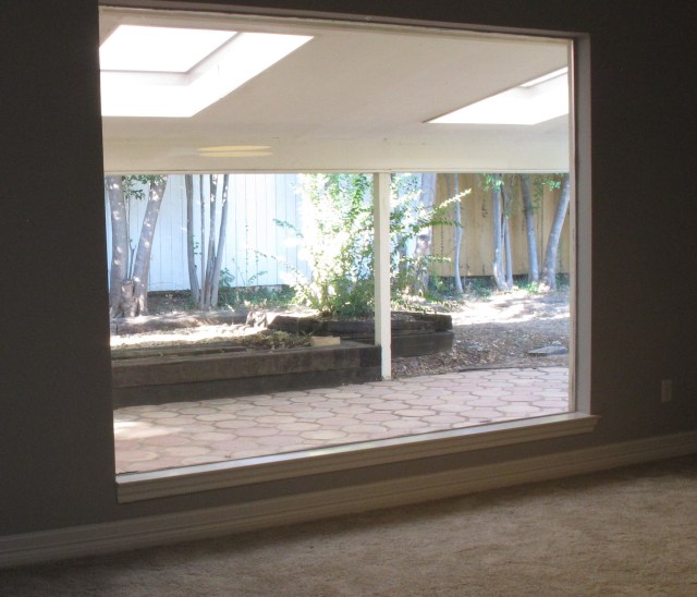
These windows look out onto the covered back patio which boasts three skylights, clay tile flooring, and a line of mature trees/hedges. It felt like an extension of the living space. Whimsical. SO. Much. Potential. Plus, the size of the living space was great. Plenty of room to accommodate guests and for kids to play.
Now, as much as we loved these things, obviously, some items needed to change. For example:
- The beige carpet – Normally, we’re okay with carpeting in a living room, but because the living room (and hence, the beige carpet) extends into the dining space (see pic below), we knew we needed to change it. Beige carpet + dining room + boys = recipe for grossness.

2. The wood tone of the built-ins – i.e.: 1970’s brown that competed with the awesome fireplace. ‘Nuff said.
3. The dated wet-bar – just BEGGING for an update, amiright??…..

The previous owners had de-popcorned the ceilings (thankyou) and painted the space a neutral tone (Gallery Grey by Kelly-Williams), which we haven’t changed (yet — but we will eventually).
Before we moved in, we had ebony laminate installed….
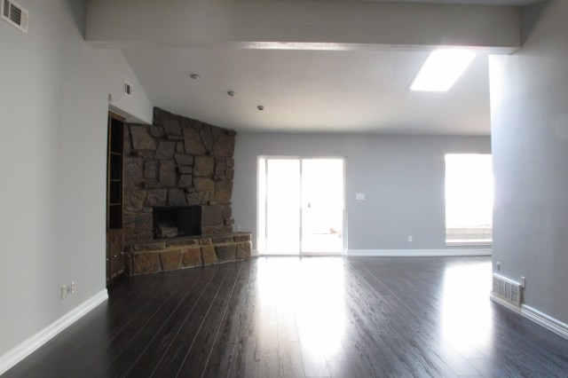
After some preliminary styling and such, the space looked like this….
It’s funny how taste changes. I look at this now and some of the styling and colors that I used back then feel so foreign. So removed from my style now.
For my birthday this year, my in-laws offered to build something for me. I asked for a table to replace the red one that previously resided behind the sofa. I designed a narrower, mid-century inspired table and drew up some plans. My father-in-law built the table and then I stained and finished it with tung oil.

Didn’t my FIL knock it out the park??? It came out PERFECT. This gorgeous table was the catalyst that got the ball rolling on the changes throughout the rest of the room. I mean, ain’t she a beaut???

Next up was the rug. I’ve always loved shag rugs… there’s nothing cozier. So, when I found the Hudson Diamond Shag by Safavieh online, I was enamored. The reviews were great and the pattern and tone was just what I was looking for. I stalked this rug all over the internet, and after months of hunting, I scored it on sale for about 30% off with free shipping (AND I went through ebates to get another 7.5% off) — which means we ultimately paid $355 for this giant, plush 10 x 14′ rug. I used gift cards from my birthday to cover most of it, so really we got off paying pennies for this gem. I mean, you guys KNOW I love a good bargain, so I was dancing all over the place when I scored this beaut. 😉
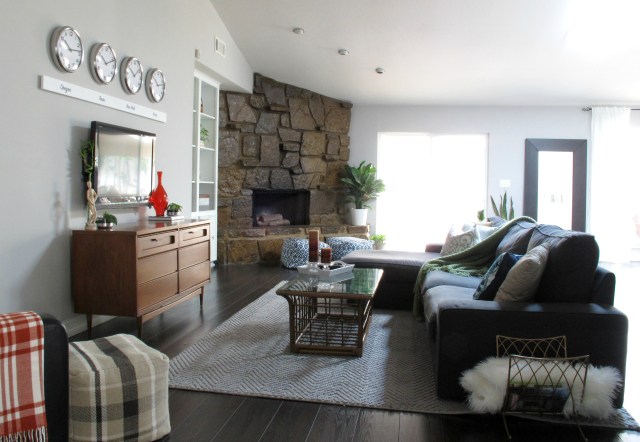
Anyways, here’s the room as it stands now…
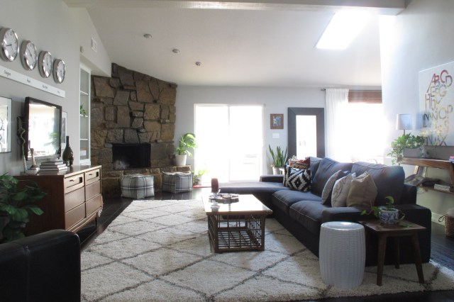
The rug MAKES the room. So cozy. We find ourselves on the floor in here regularly now because we WANT to be there. It’s such good quality, too. Soft, plush, it doesn’t shed, and has enough color variation in the fibers that stains are easily hidden. It’s the BEST.

By the fireplace, I traded out our navy ikat poufs for these sweet plaid ones. I found them at Ross for $9.99 each!!!!! It was like fate. I grabbed them and practically ran to the check-out line. When the cashier saw the price on them, she even freaked out a little. Major score in my book. They tie in so well to the rug and the new neutral tones of the space.

The TV area also got a little love. Two black and white landscape prints in black metal frames flank the TV and really help to ground the clocks above them. I moved the basket to the other side and added a fake fiddle for some greenery on the other side.

Over the chair in this little corner, I hung a plant from a rod to visually balance the display. I sketched out two cactus line-drawings on poster board which I framed with two Ribba frames from Ikea and hung on the adjoining wall. I love this little area now. It just feels right to me.
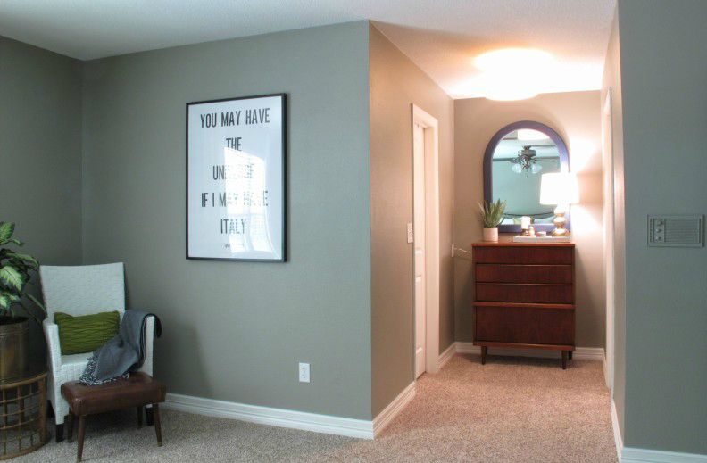
Another view over the couch into the dining room…

And finally, the wet bar…

After a rotating string of decor, I finally settled on this simple, modern bench (from Target.com) and a print of NY City (from Ikea). I grew up in New York, so I think it’s fitting. And guys. It’s my favorite. This area, I mean. It’s functional and not overdone like some of my previous attempts (you may have seen the barcart if you follow me on Instagram). And the pillow. The pillow is so good, guys. I absolutely love it. It was also a Target find. I’m planning to concrete the countertop on the wet bar and tile the backsplash. I know. I’ve said this for about three years now, but I really mean it this time. Swear! 🙂
And for those who aren’t on Insta, allow me to leave you with this gem. (Ie: Joey, making things interesting on one dark, stormy day)…

So, that’s where the living room stands now. It’s cozy, functional, and exactly the vibe I’ve been trying for. It only took three years, but we’re finally on the right track. Haha! 😉