Howdy, all!! It’s been a while since I’ve posted about our front room. Last we left off, it looked like this…

Now, don’t get me wrong, the room looked fine… But, it’s located right off of our foyer. And as our foyer makeover commenced and the space became increasingly lighter and brighter (the most recent pic is in this post), the front room seemed so much darker and more drab in comparison. Honestly, I blamed Art. He’s the artwork above our Friheten sofa (…whose name, coincidentally, is Fri… I know. My talent for naming things is not to be matched.). Anyhoo, Art felt a little heavy to me. A little dark and traditional for my taste. I picked him up for $40 at Ross about 5 years ago because he was the right scale and colors for the hallway in our last house, but honestly, I was never totally over the moon for him.
After we moved into our current home, and our front room went from single to bi- to tri-functional, I stuck Art over the couch. The space needed something and I already owned him (ie: he was free), so I figured it was a good “for now” solution. I’ve always had it in mind, though, that I wanted to change Art in some way. I’ve tossed around a few ideas over the years, but was never really sold on anything in particular. Then, one fateful day several weeks ago, I found this picture on Pinterest…

{Source}
I think these are actually wood letters mounted to the wall, but I loved the typography. The angular letters that all fit together. The asymmetrical arrangement of it. THIS is what I wanted to do with Art.
Now, I’ll just start by saying that a MUCH simpler way of transferring the image would be copy it onto a transparency and use a projector to transfer the print. I, however, am impatient. And didn’t feel like taking the time to track that stuff down, so I just freehanded it with my iPad by my side as reference. I used a ruler and a piece of chalk for the straight lines…
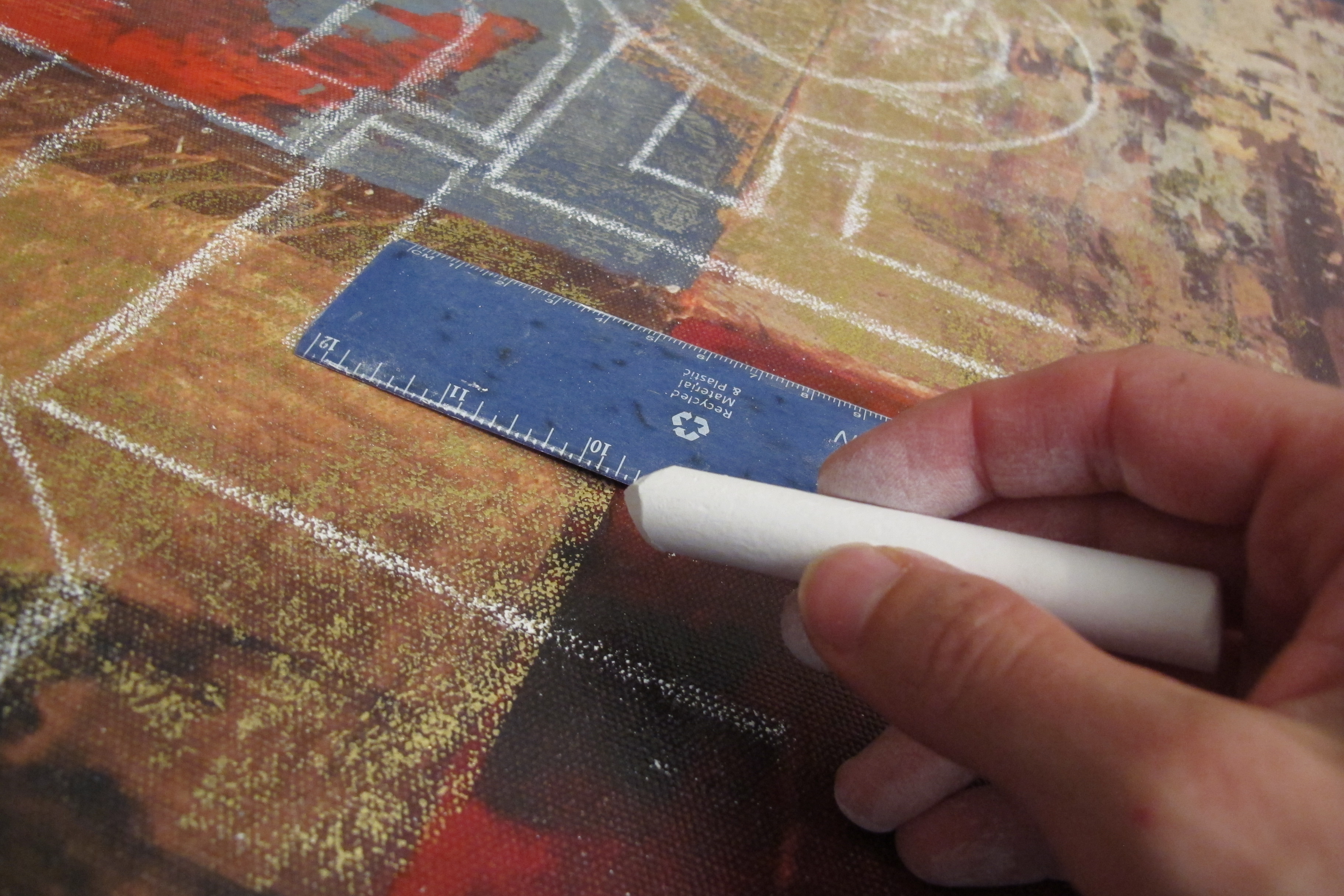 …and this bowl…
…for the outside of the round letters. I freehanded the inside of the round letters and any other roundish letter that wasn’t a perfect “O”. Like the B, P, S, etc.
About halfway through, I realized that I wasn’t going to have room for the “Y” and “Z”, but after a preliminary quick sketch of the rest of the letters, I decided that I liked it that way. It was almost as if the letters were melting off the page.
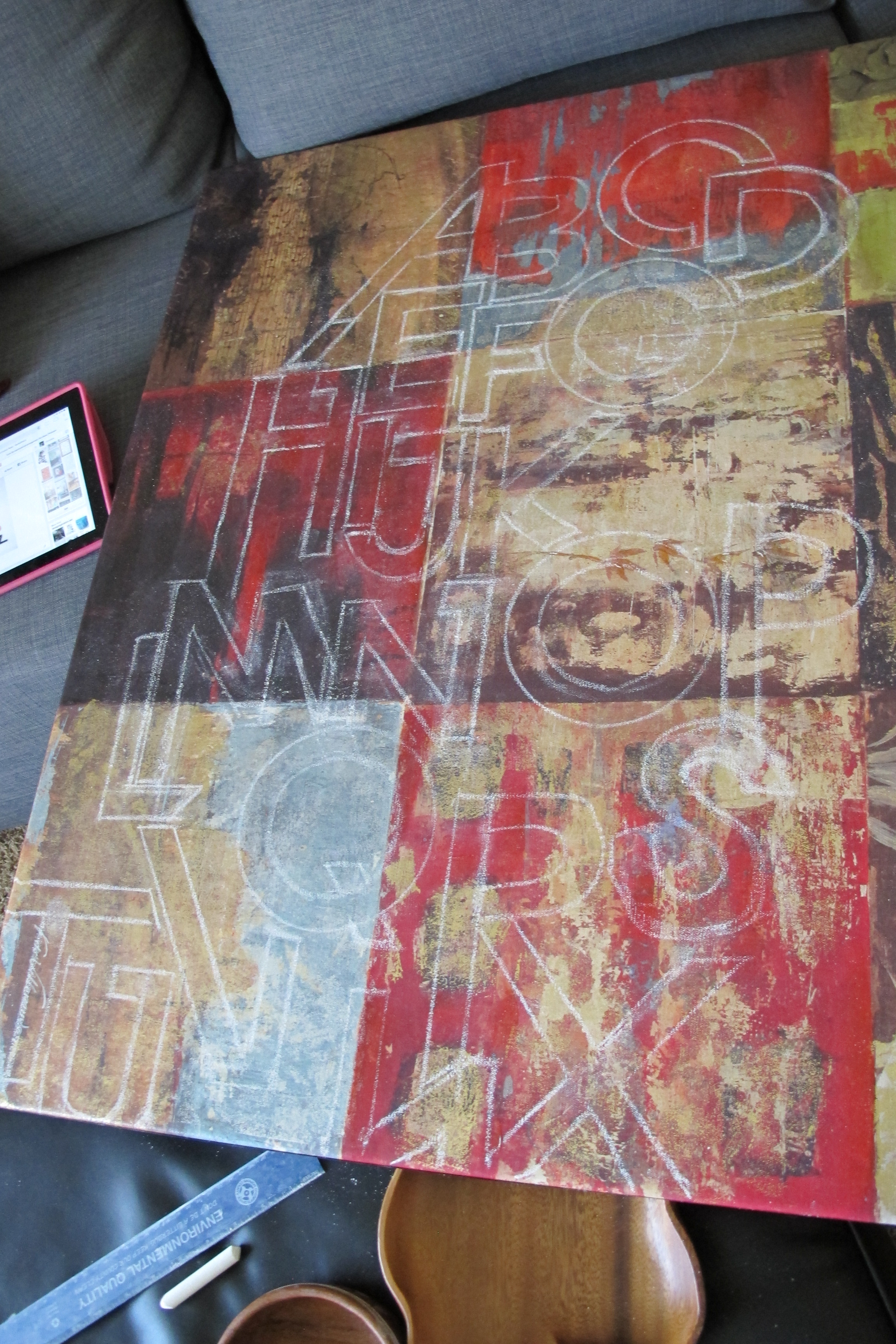
When my chalk outline was complete (totally picturing an old-movie crime scene right now), I moved on to painting. I used some Clark & Kensington paint + primer in ultra white that I had in the garage and followed my chalk lines with a small brush and a tiny ruler that just happened to fit inside my letters perfectly…

…then I used a slightly larger brush to fill between the letters…

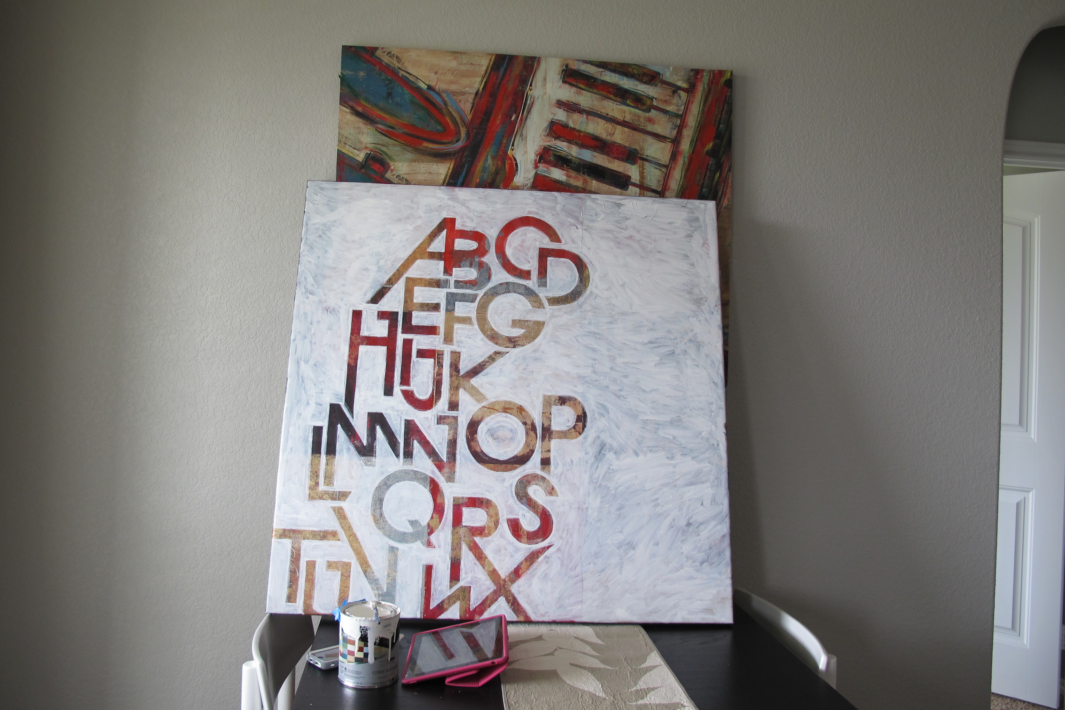
I decided to carry the letters off the side of the canvas to further add to the “melting” illusion…

This is after one coat of paint….
At this point, I grabbed a damp paper towel and wiped off all the chalk just to be sure that there weren’t any other areas requiring paint touch-up…

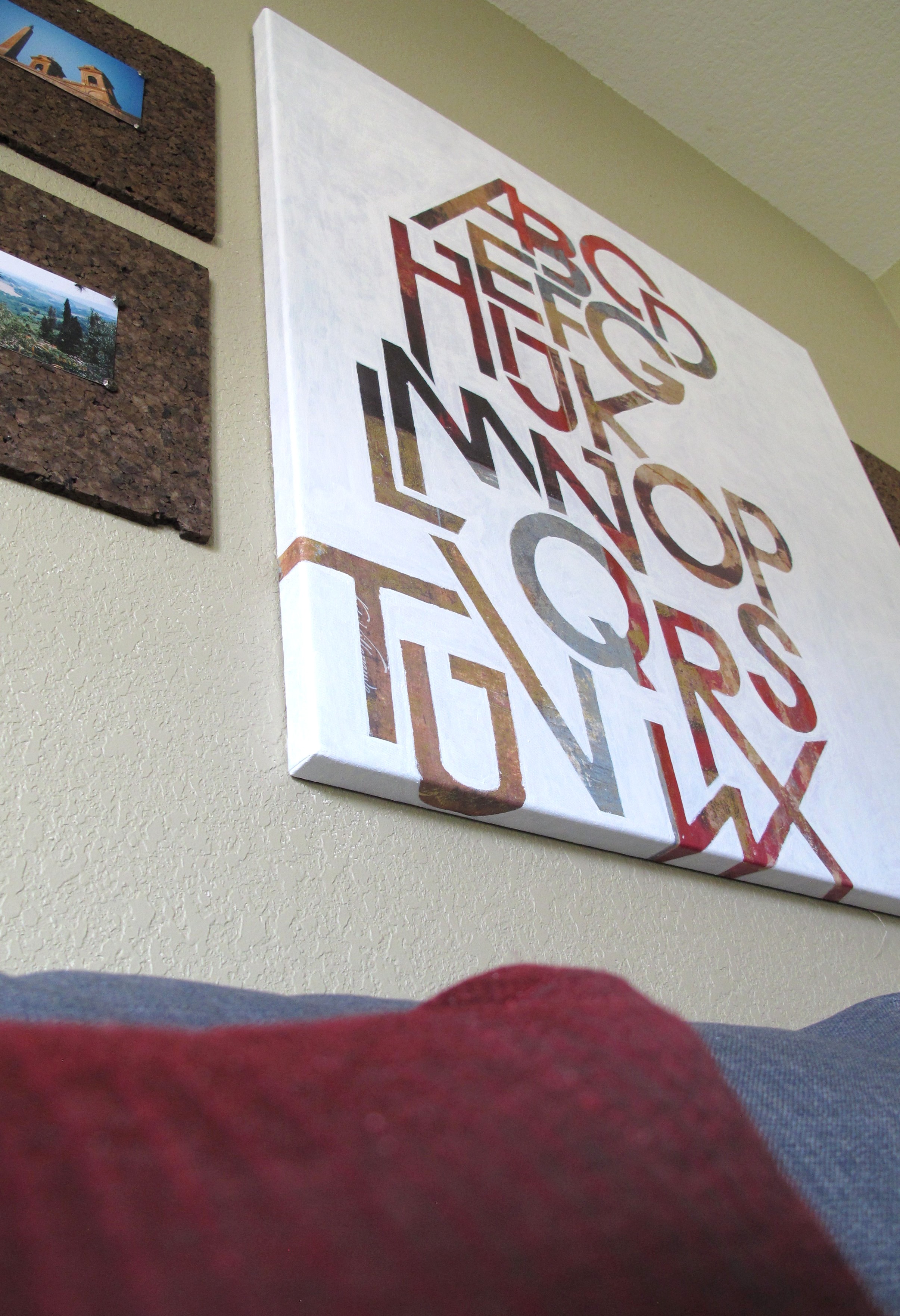
Cleaning off the chalk made such a difference! The letters looked crisper and more defined than I realized they would. And thus began the unrequited crush I now have on my new/old friend Art. Once, I collected myself, I CAREFULLY applied a second coat of white paint. And here’s the final (totally-exciting-to-me) result….


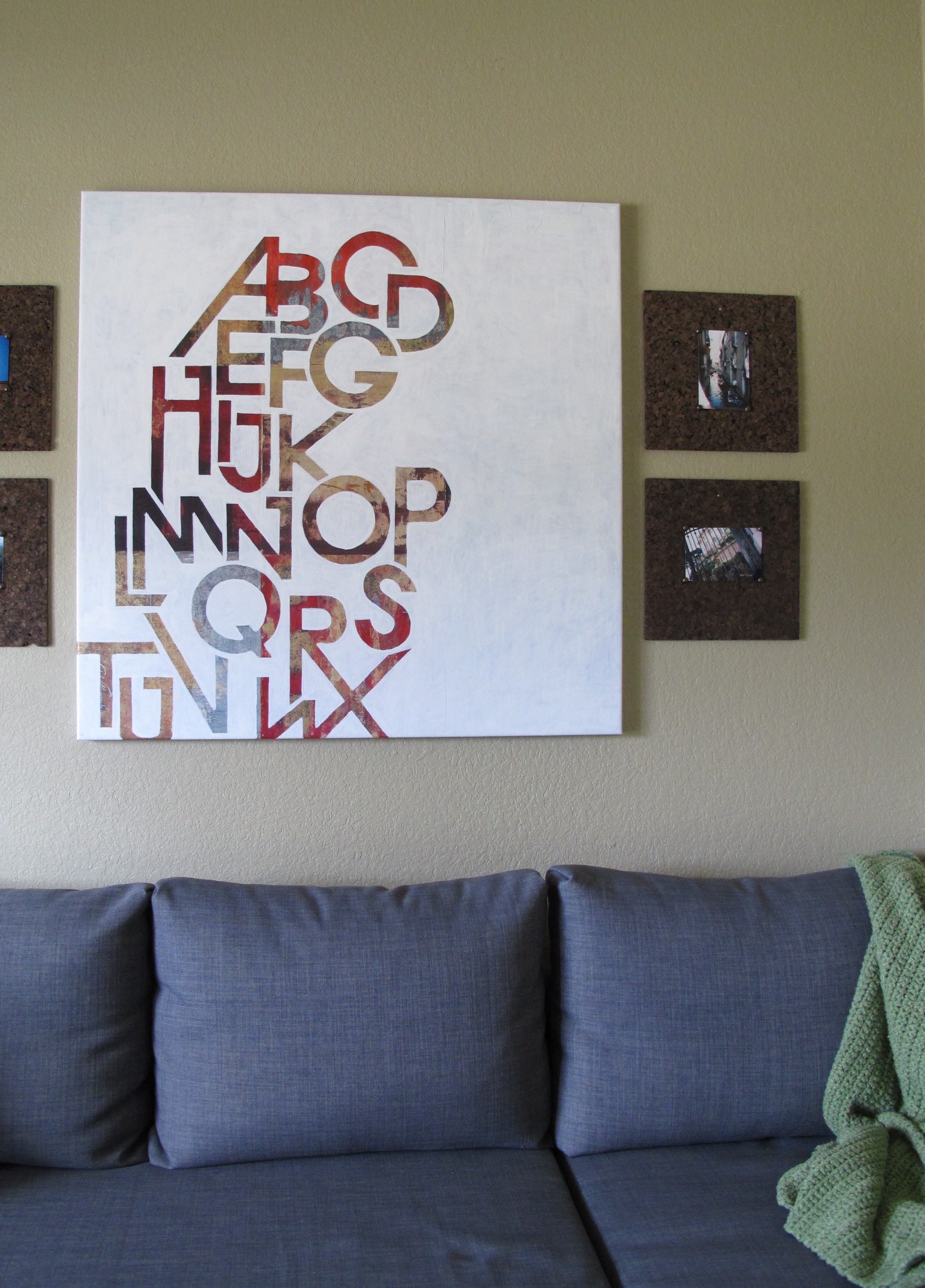
This next shot is kind of a dark, crummy photo, but I wanted to show you guys the differences in sheen. The flat white paint really allows the metallic sheen of the letters pop…

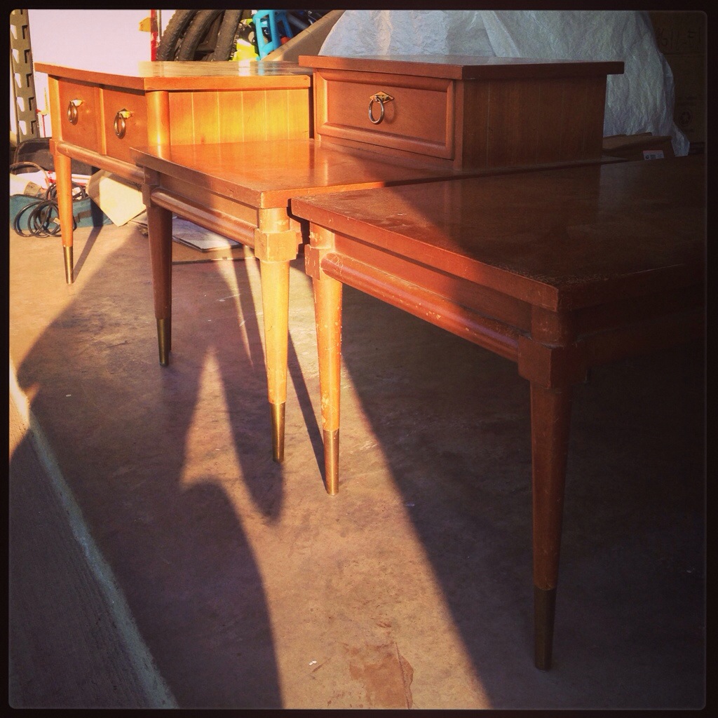
Art really brightens up the space now and adds such nice crisp, modern feel. I love the graphic nature of the painting, plus the mottled colors within each letter now pop and highlight the colorful accents throughout the room. I’ve got some other ideas for brightening the space as well… but *clue*… I’ll have to see how my mid-century tables turn out before I have a concrete plan. I worked on the coffee table some this weekend, so hopefully I’ll have an update for ya’ll soon.
But back to Art, this entire project was free for me since I already owned the canvas, paint, chalk, etc. I’m so happy that I decided to devote the time to completing this. I would say that this project probably took me about 5-6 cumulative hours total. And it was totally worth every second (and every ridonculous knot in my shoulders after the hours spent craning over my sprawling letters). So tell me, do you guys have any random art laying around that you’ve considered altering?
Like this post?? Share it or join me on Facebook or Instagram!
Linked up at:I Heart Organizing, Home Stories A to Z, DIY Show Off, Home Coming, City of Creative Dreams, Tatertots & Jello, Elizabeth Joan Designs, Lines Across, I Should Be Mopping The Floor, Tip Junkie, Upcycled Treasures