Wah-hoo!! It’s amazing what a little impending overnight guest does for a little kick in the pants. It’s been a crazy week. I know I’ve said it before, but I really mean it. We’re having company this weekend (really, for the first time since moving in), so it’s been a mad dash to try and get some unfinished projects done. The house is (of course) nowhere near finished (that’ll take YEARS, I’m sure), but we just wanted to clean up a few things that were needing some immediate work. And in this mad race, I didn’t stop to take “after” pictures until today. #mybad
Anyways, as the days go on, things at the ole’ homestead are slowly coming back together again and my head feels like it’s gradually reattaching to my brain, which is nice. So, here’s what’s been going on house-wise. Joey’s been a mad-man out in the backyard (I’ll have a post about that soon), and I’ve been checking off a bunch of items inside. Among them was the office/guestroom. Here’s how it looked the last time I showed it to you…


It’s a great room in that it gets really fantastic light in the mornings and has a pretty view out of the window. Which you can sort of see here (sorry about my photography skills)…
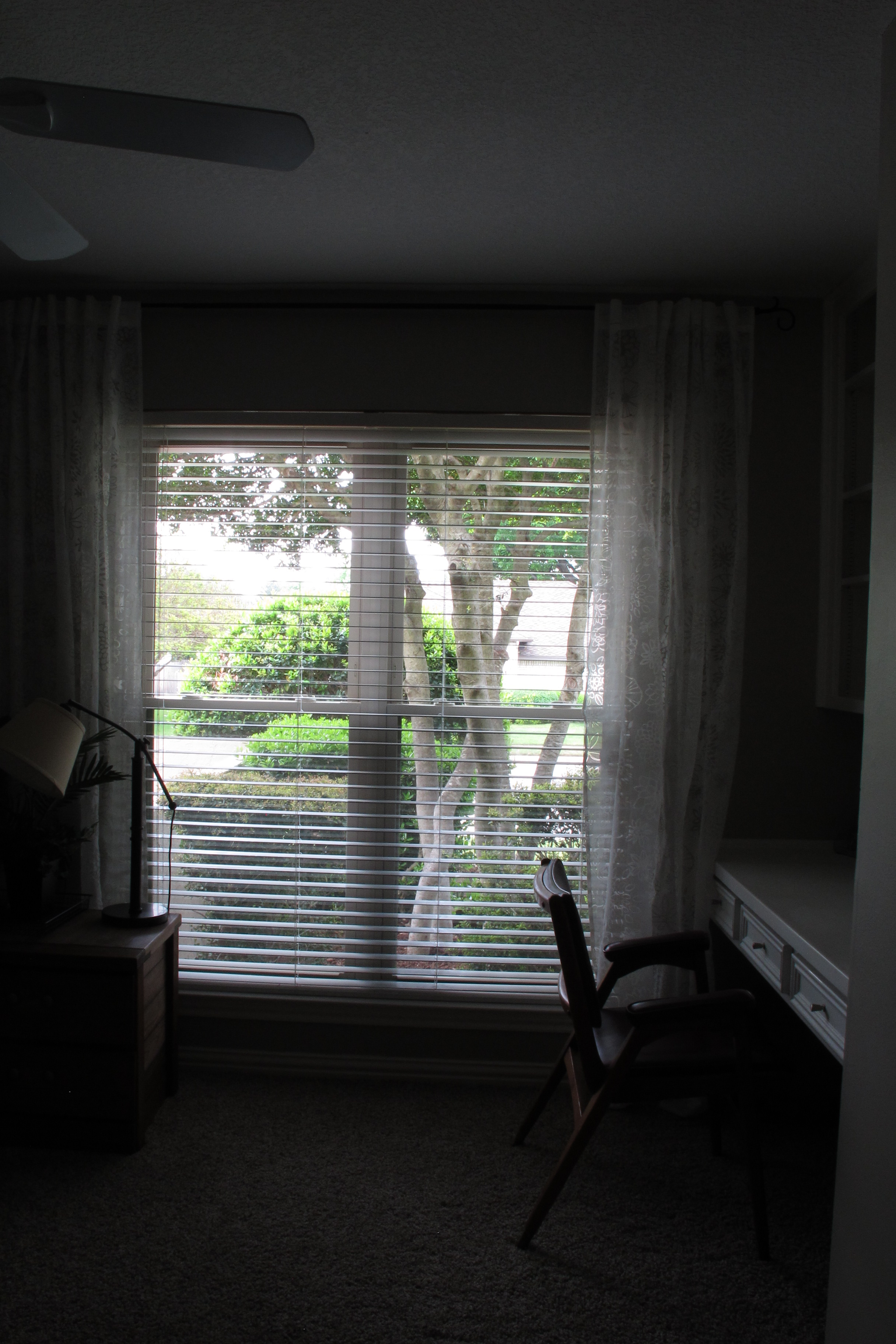
It’s the smallest of our bedrooms, but is still a decent size. My main issue with it was that it REALLY needed to be painted. It was the same peach color as the master bath and since it was a flat paint finish, it was really dirty in spots. Plus, this was the room that we had the flood prior to moving in, so the drywall was patched, but not painted.

Not a good look if you ask me.
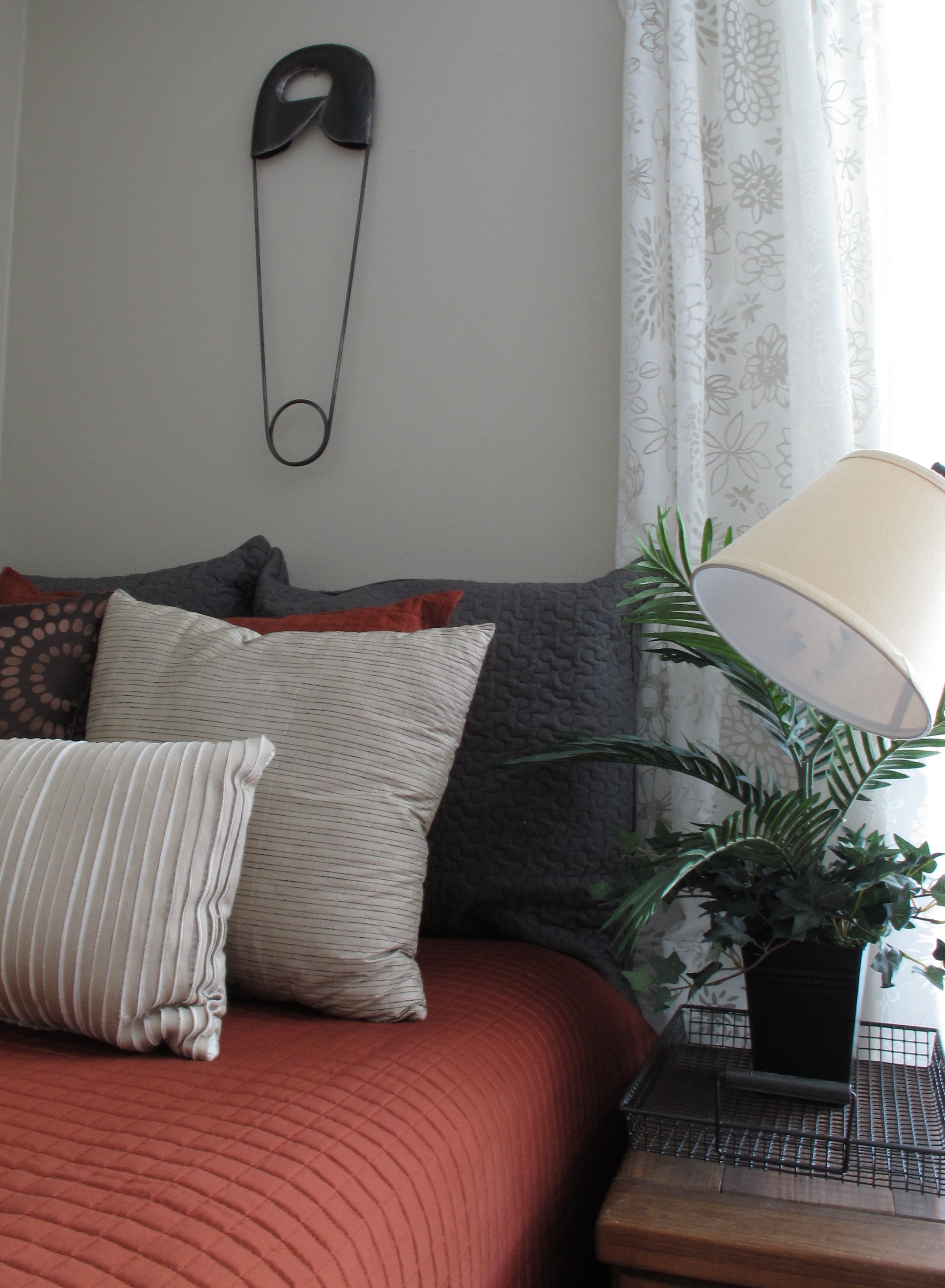
This room contains most the decor remnants from our very first house that managed to survive our multiple moves. That house had a very “Tuscan” color scheme. Taupes, greens, reds, with cherry wood accents. Very different from our last and current houses. So, the brownish accents that I still liked enough to keep, are pretty much in this space only. Now, I’ll admit, my taste has changed and I’ve mentally dubbed these as “for now” pieces. But regardless, I’m grateful to be able to use them to decorate the space (forfree) until I find new stuff to replace them.
With this plan in mind, I wanted to select a paint color that worked with these items, but would also work with a cooler color palette for when I eventually change this stuff out. And the color that I landed on was Loggia by Sherwin Williams (ie: the same color that we painted our house’s exterior). Its a neutral taupe tone that has more grey than anything. It could easily work with cool colors, but fits in swimmingly with warm as well. Basically, if Joey’s personality was a paint color it’d be Loggia. He gets along with everyone.
I’d originally intended to get the paint color-matched with a cheaper paint to save some money, but when I went to Lowes I realized that they now sell an affordable line of Sherwin Williams paints! Perfect! They were able to simply pull up Loggia in the computer and mix it exactly. I chose the cheapest paint (Ovation) in an eggshell finish which ran me just over $28. Not too shabby. Once I got home, I got down to business, which pretty much resembled the state of my brain the past few weeks…

I have to say that was super impressed by the coverage of this paint. In the words of that guy in that Indiana Jones movie (you know the one ;))… I chose wiiiisely. Here’s the difference in the peach vs. Loggia…

I loved it immediately. It’s taupey grey neutrality. Even in it’s half-wet state.
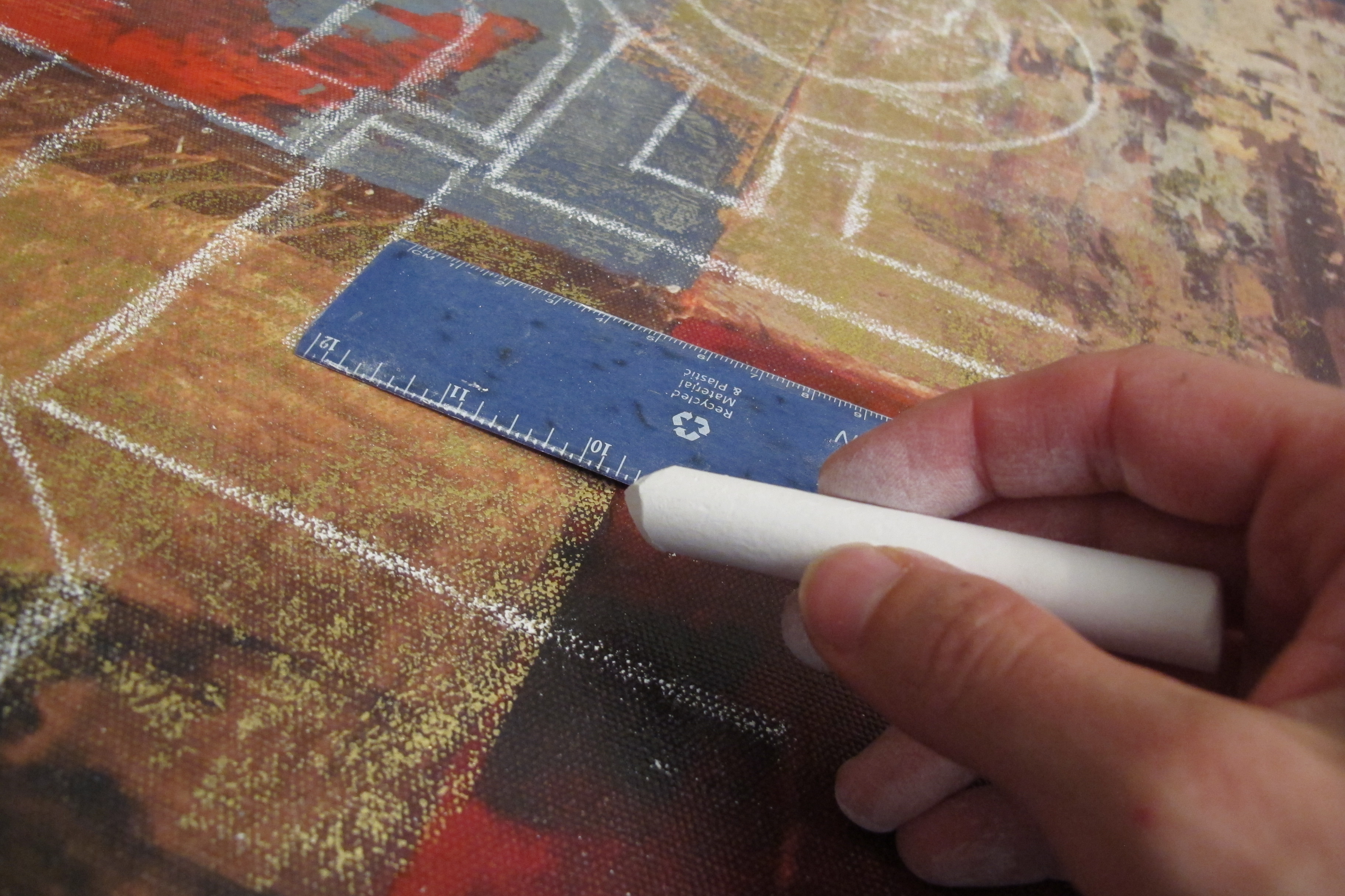
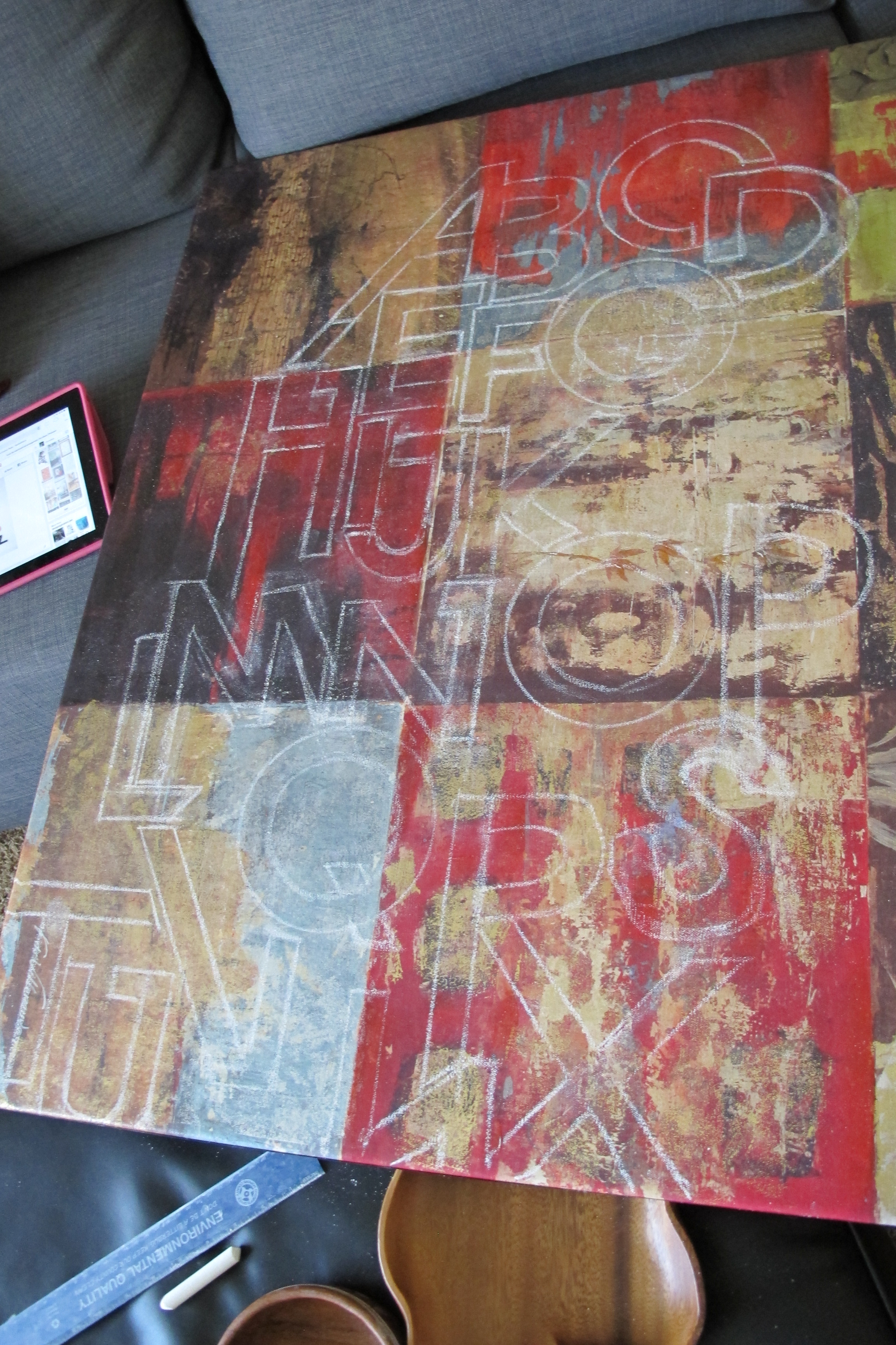
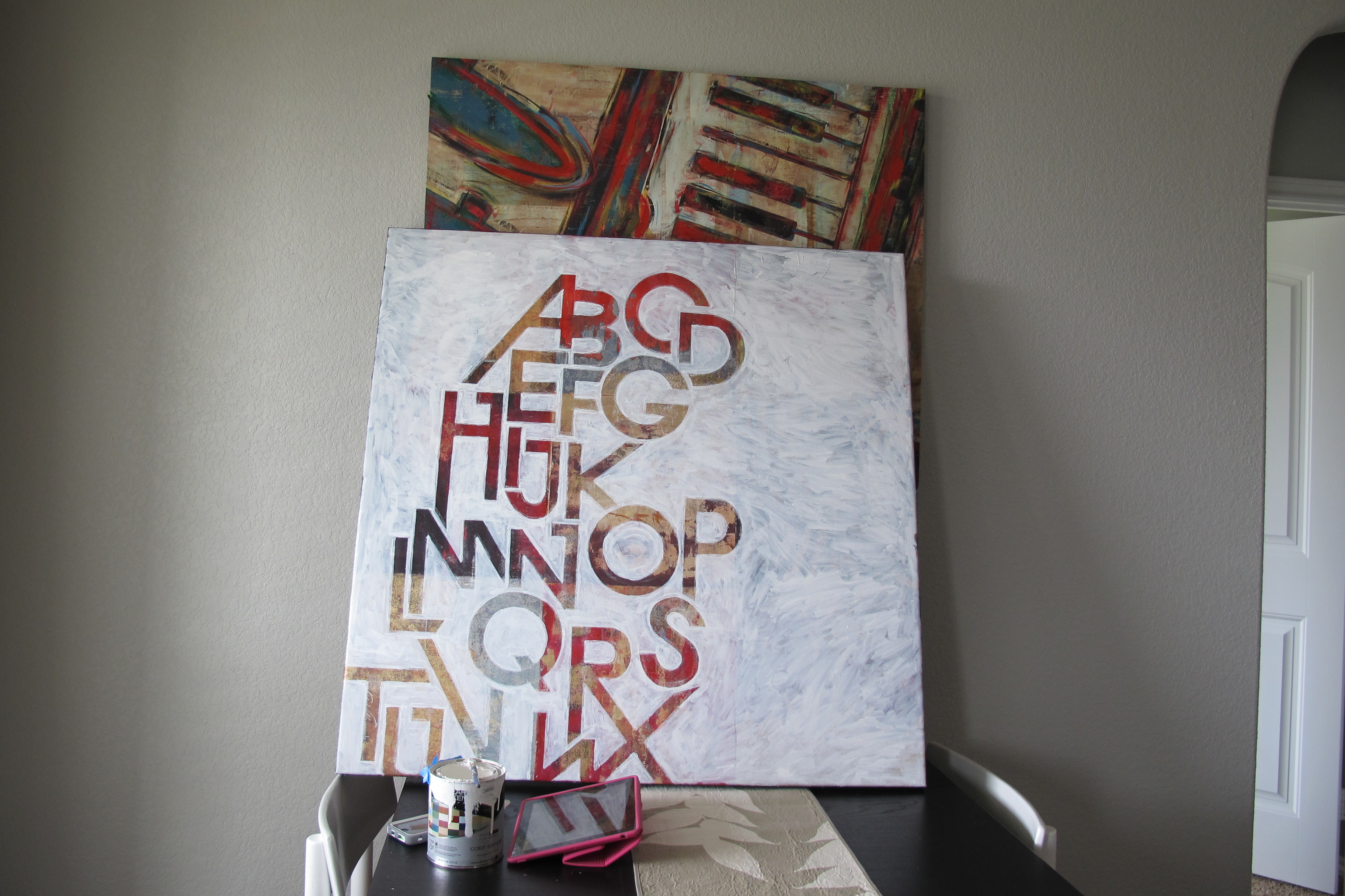
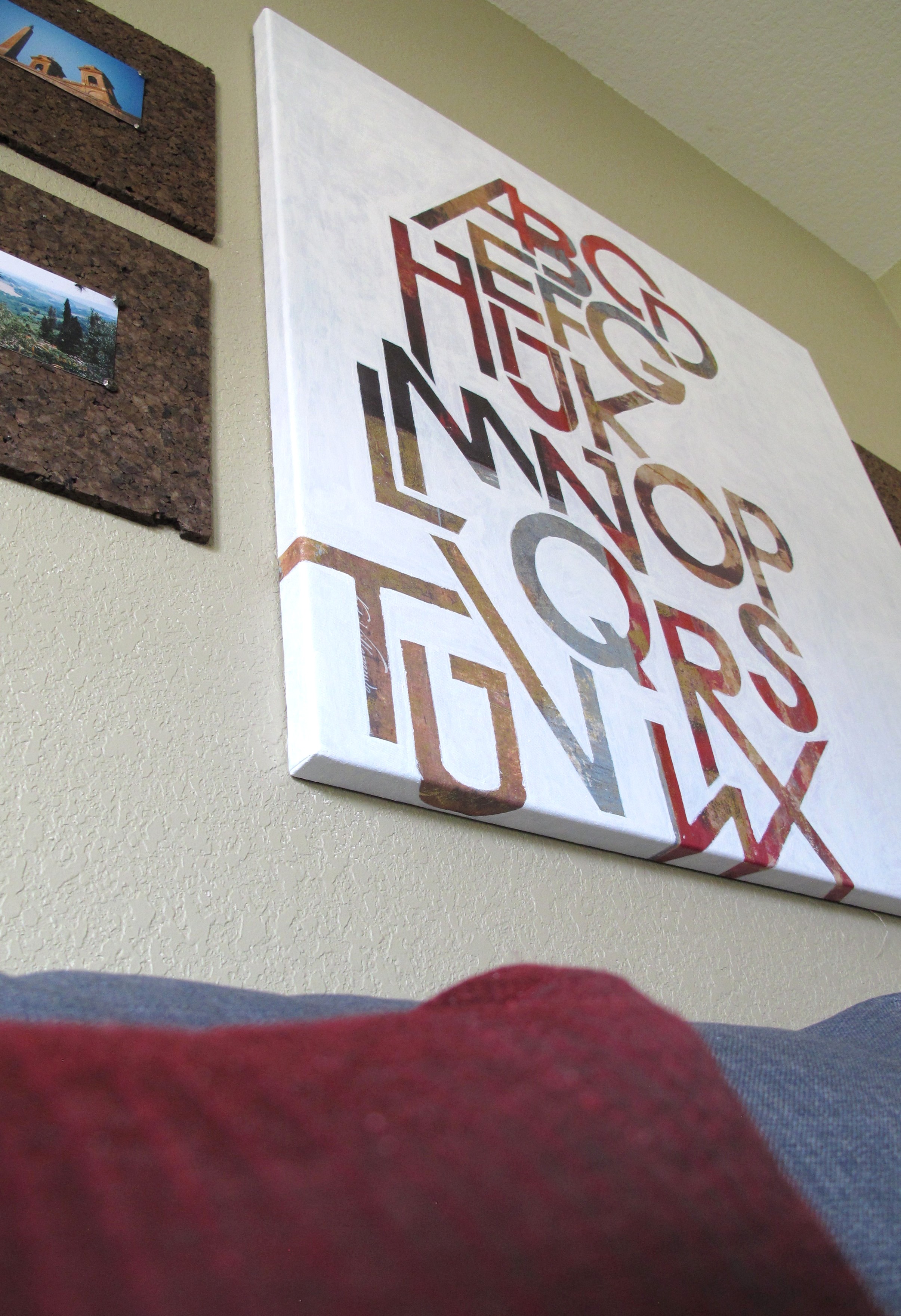
Once I had the walls painted, I moved everything back, hung some curtains and the art that I already had on hand, which left this…

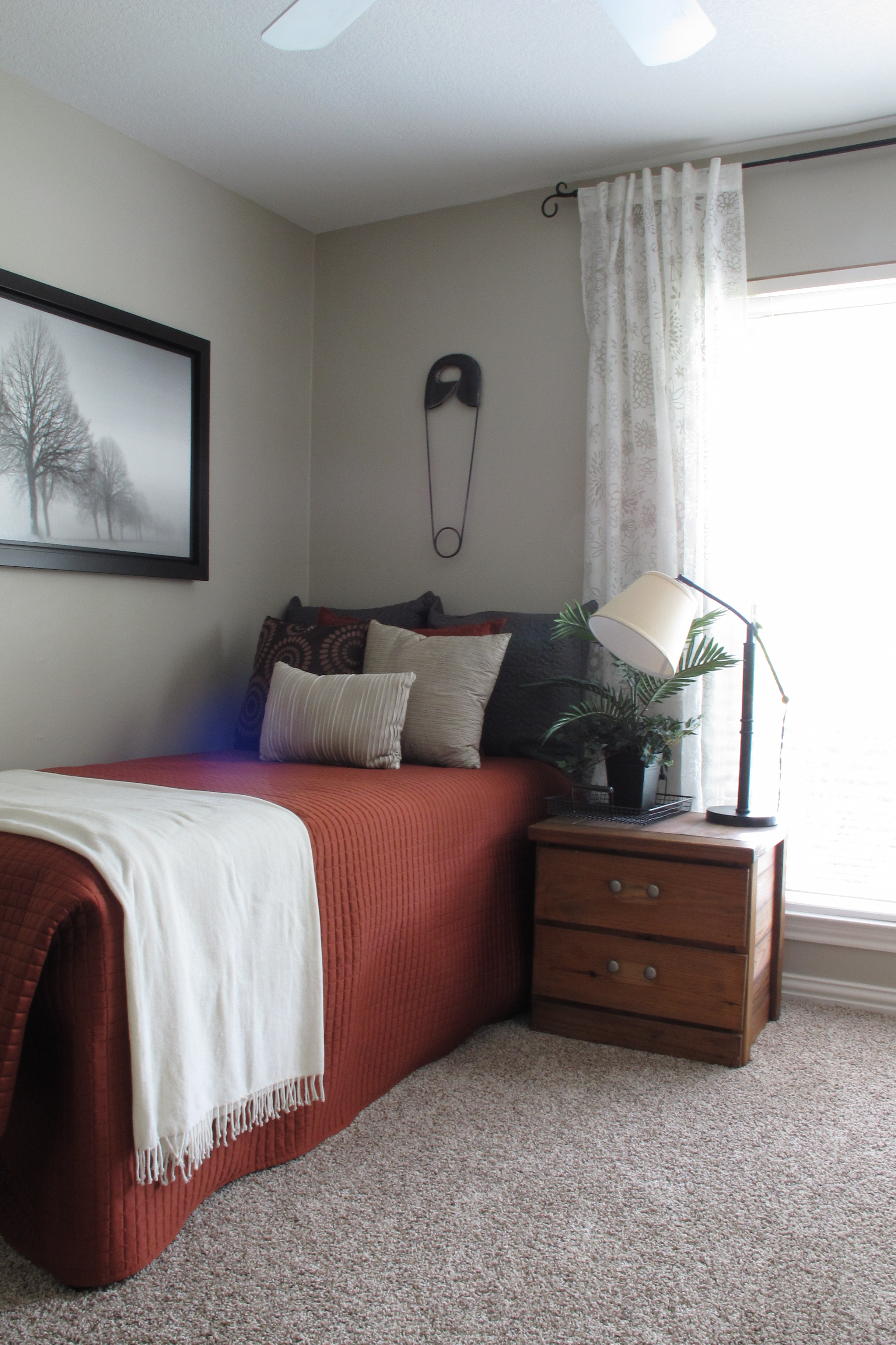
It always amazes me how much a set of curtains adds to a room.
In reassembling the space, I actually tried floating the bed on the adjoining wall (with the head beneath the painting) so that everything wasn’t so crammed against the perimeter, and it looked much better than the current layout. Then, I realized that functionality-wise, I wanted more floor space. I sometimes do workout videos in this room and I like just being able to plop down without having to rearrange the furniture. So, in this case, I’m sacrificing looks for function. Honestly, I’m just glad to have enough space to do that. Our last house had such small rooms, that I really didn’t have space to workout in any room without bumping into furniture (even after I’d moved it out of the way).
Here’s the desk area as of now…
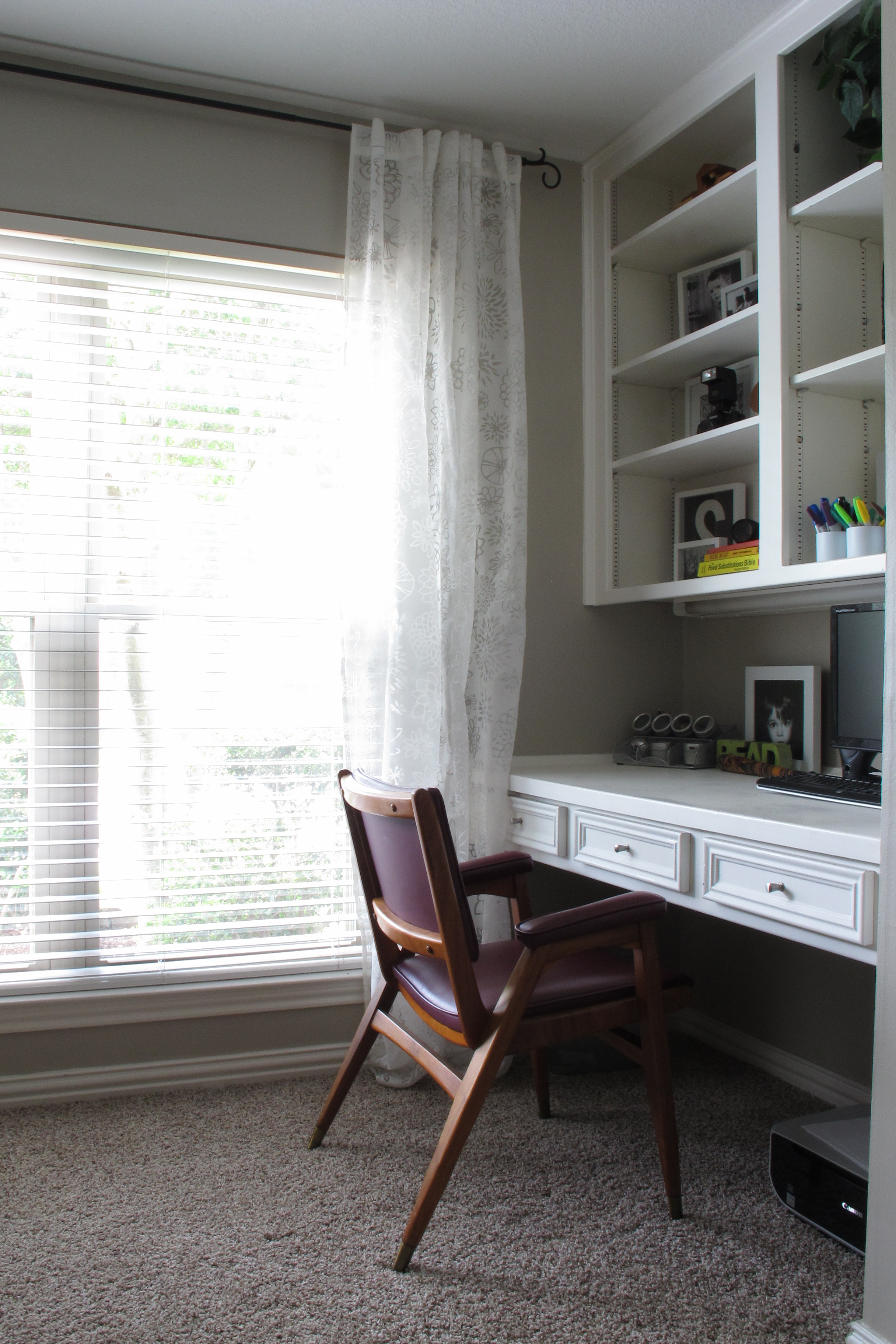
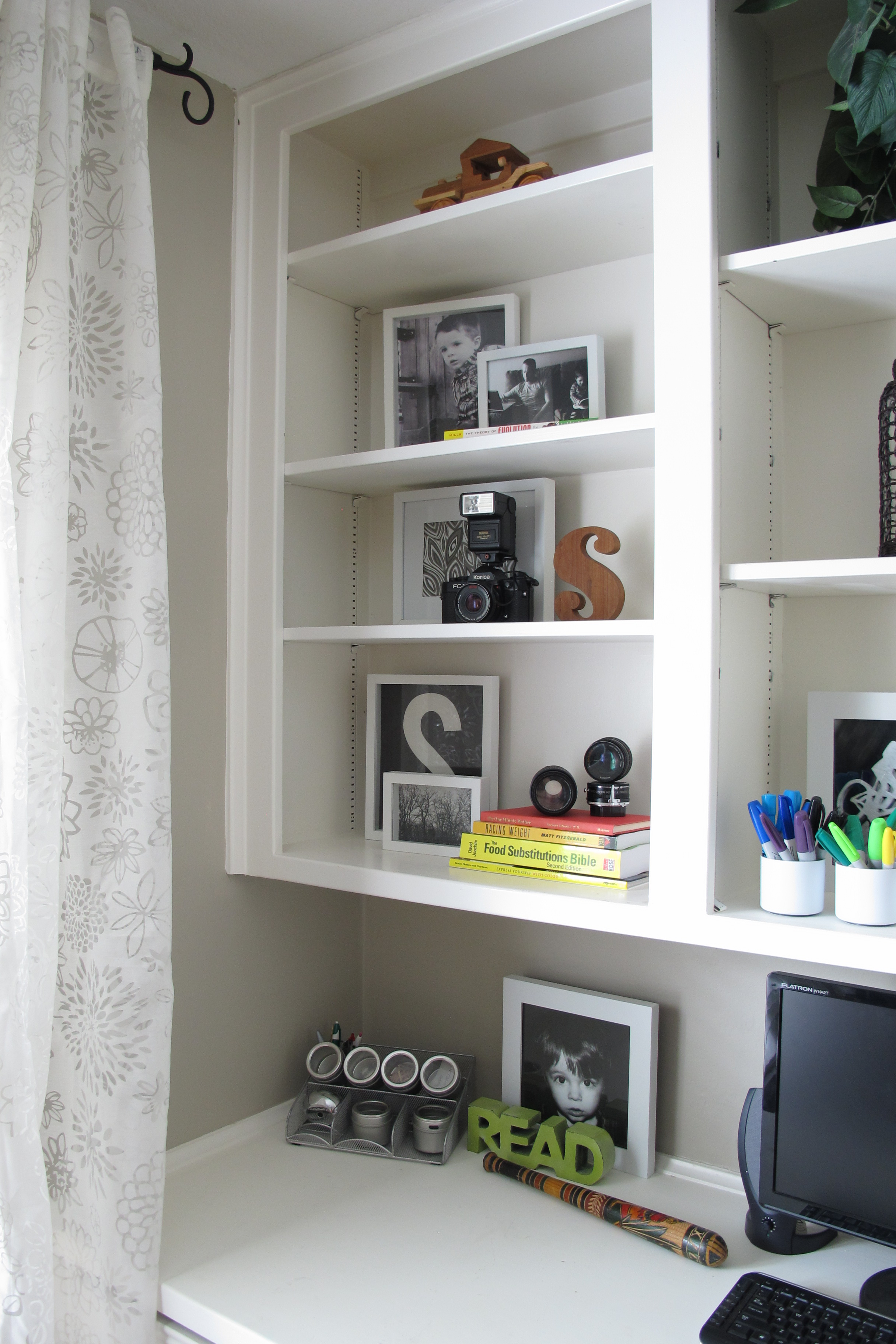
I simply styled the shelves more and switched out the desk drawer knobs for those delicate little guys that I found at Target on sale for $5 for a set of 10. See that old school camera and the lenses on the lower shelf??
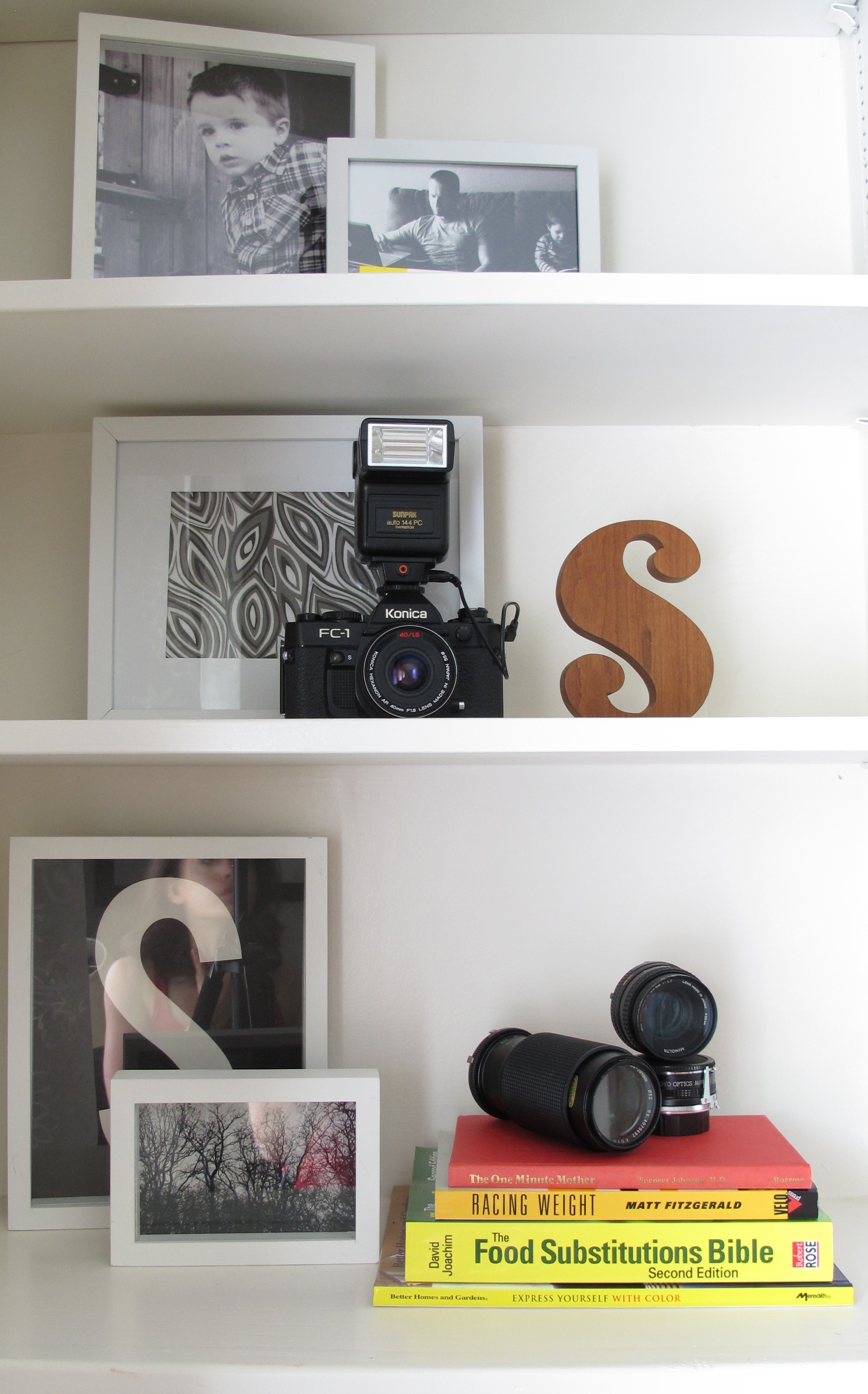
I got that as a white elephant gift at a good friend’s Christmas party. I’m not sure who gave it, but I happen to think its completely awesome.
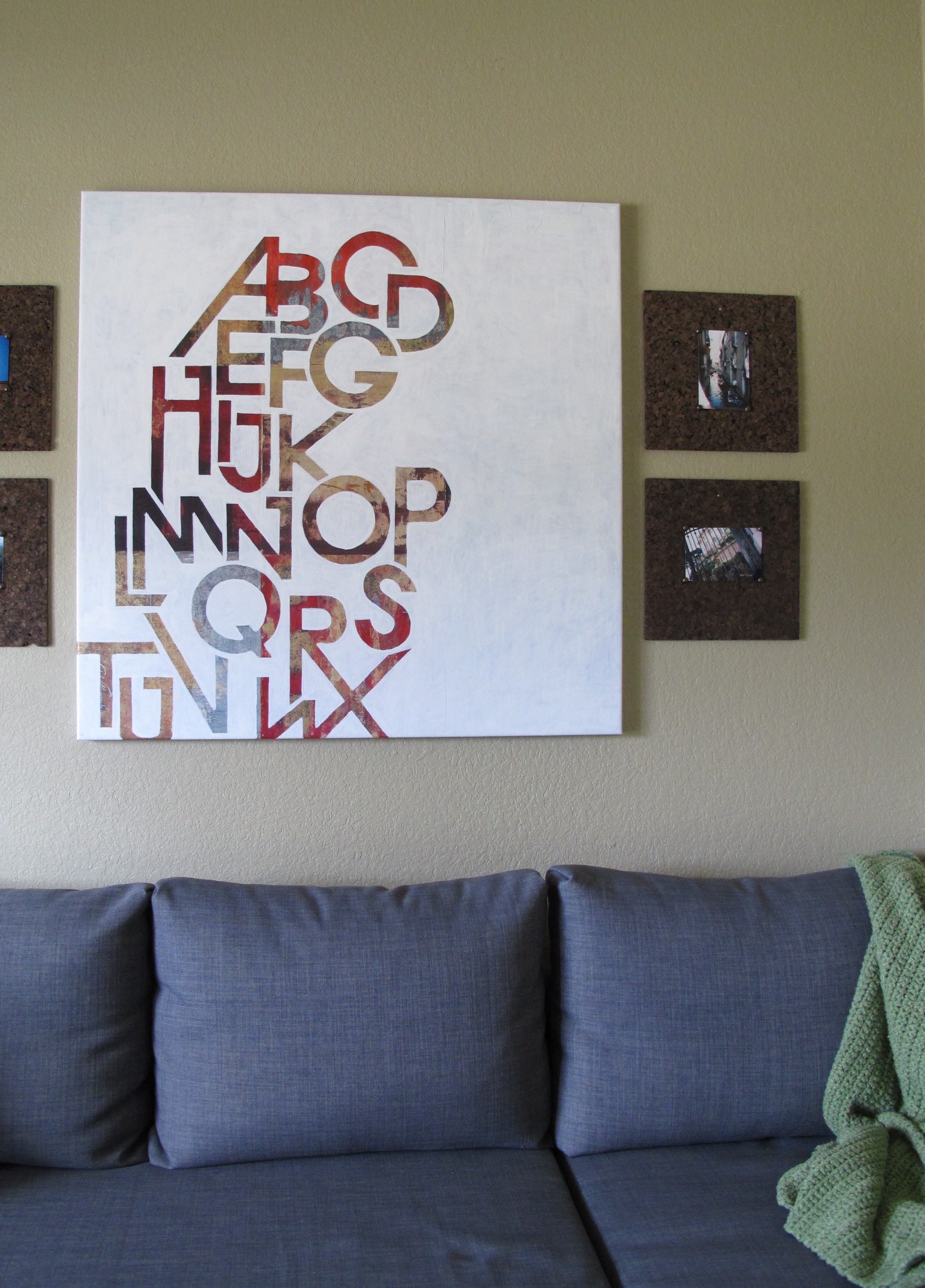
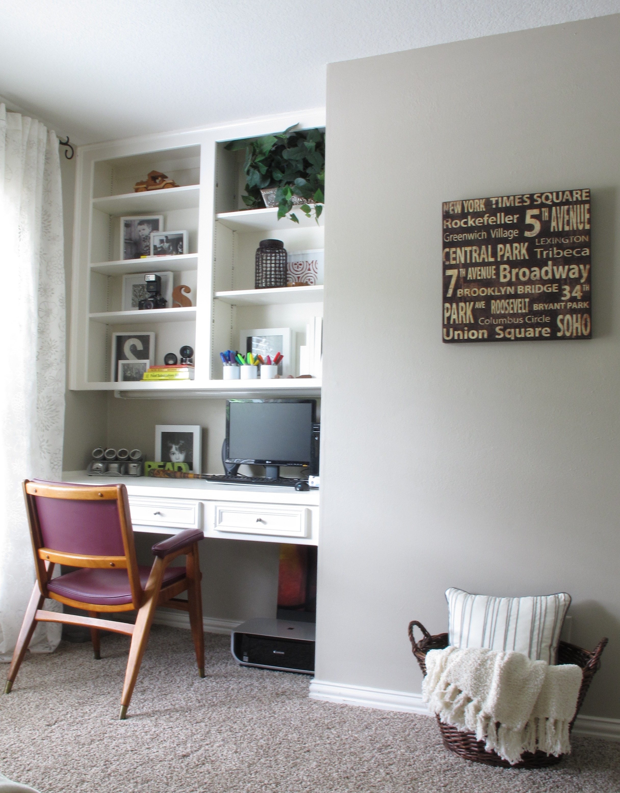
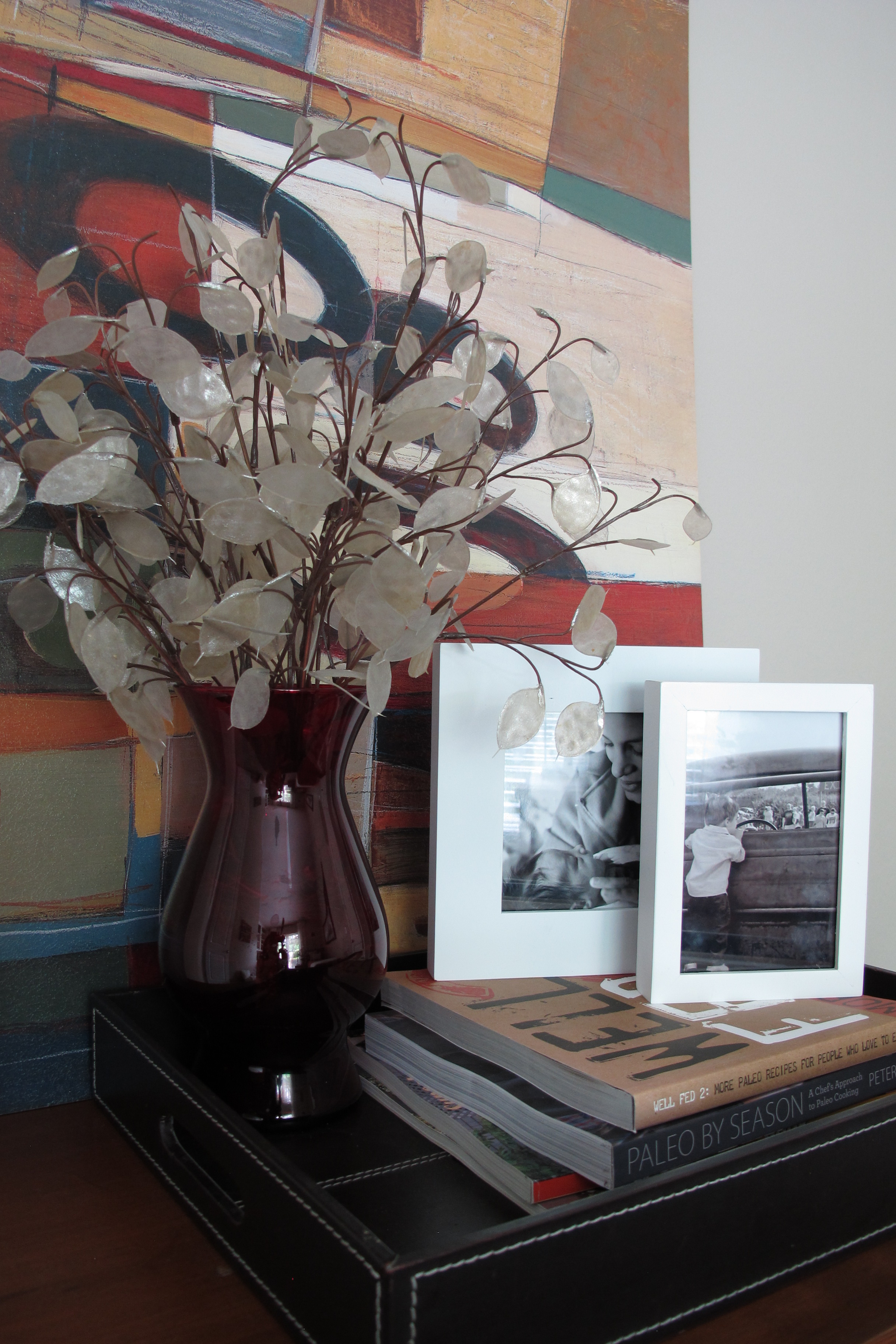
And lastly the wall that that backs up to the hallway…
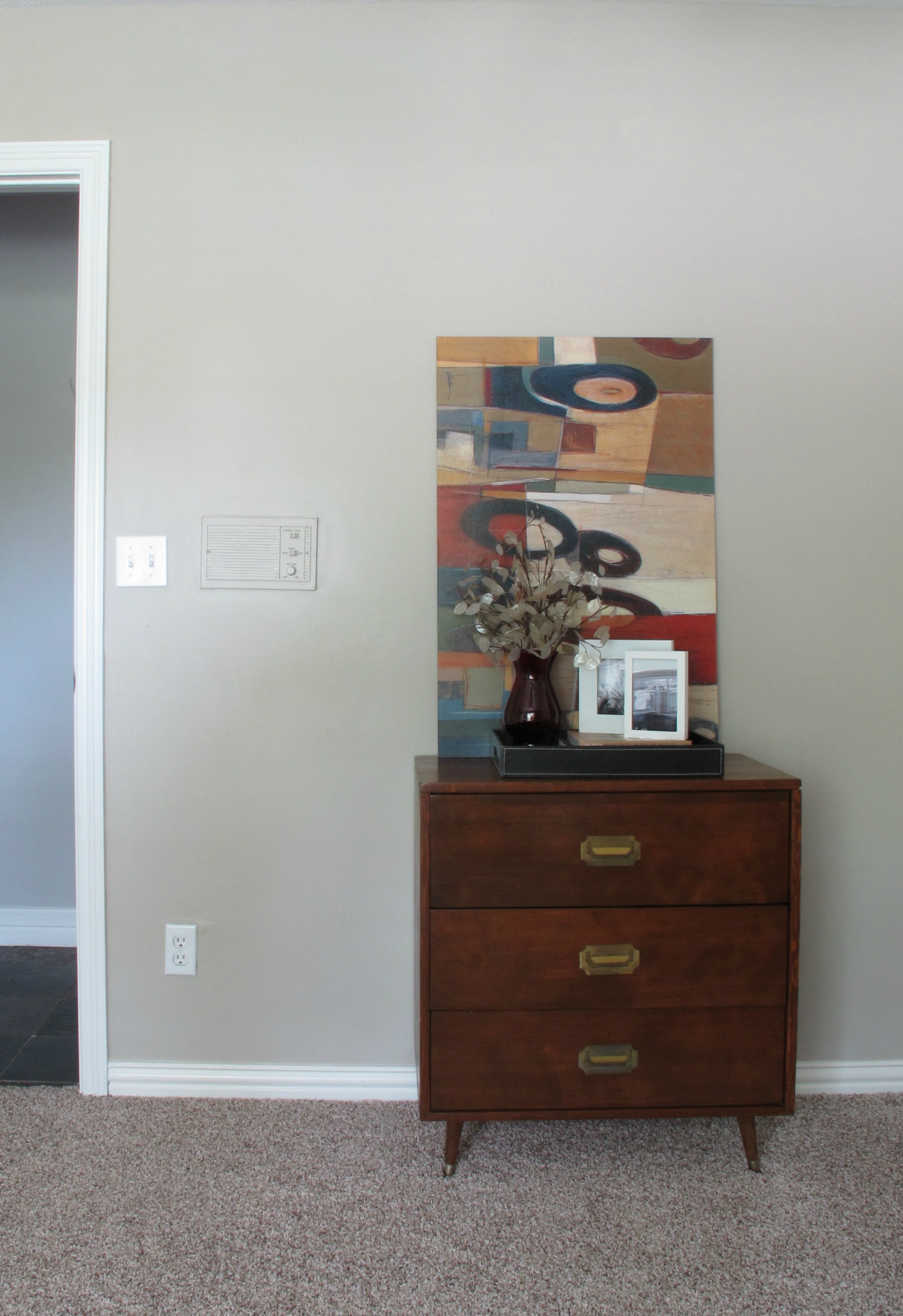
I still have some more tweaks that I’d like to do in here… I’d love to someday get a headboard, jazz up the nightstand, improve the bedding, get a wireless printer so that we can hide that eyesore, and add a nice area rug for interest, but this room definitely jumped leaps and bounds from where it was. I’m just glad to have this done and to be able to say “…and this is the guest room/office…” minus the “…we still have a ton to do in here. Pay no attention to the walls…” part. 😉
***For updated pics on this space, check out this (creating a wood-framed art headboard), this (revamping a mid-century nightstand), this (adding a new awesome $12 lamp) and this (creating DIY burlap wall art).***