A little birdie told me…

Hello all!   So, this is a project sparked by my little man and his creativity.   The other day, I was driving to my parents’ house after work to pick up Lucas, when my mom told me that Lucas had made me a surprise.   Now, I love surprises, so of course I was ecstatic.  I hurriedly made my way over there and was greeted at the door with a giant Lucas-hug and this…

 IMG_6001

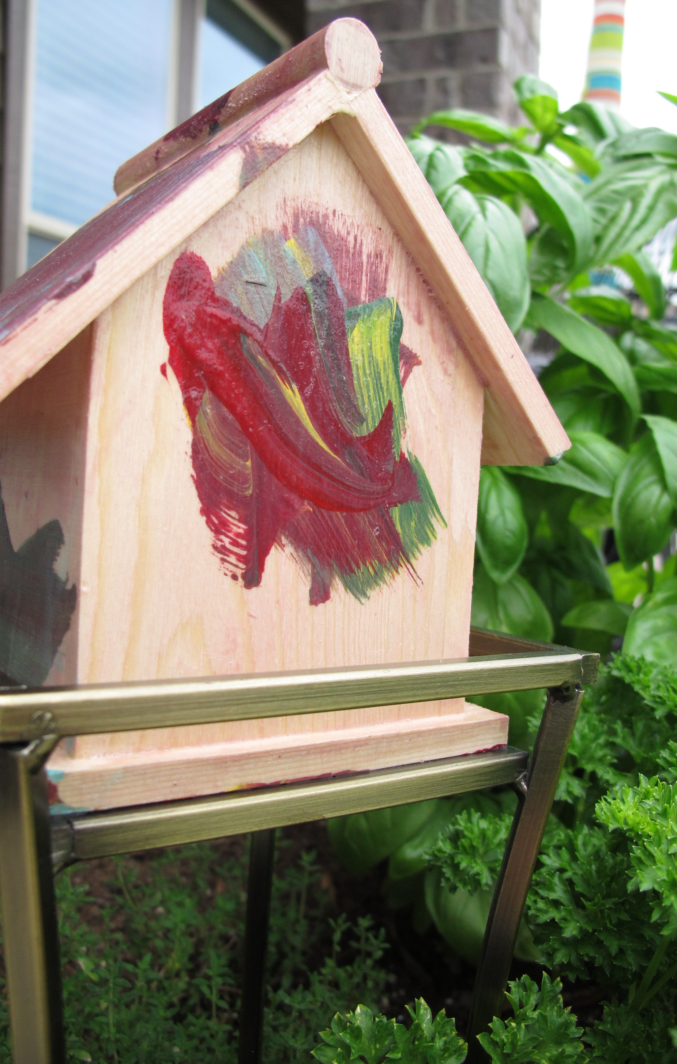
A little Lucas DIY!!  Pride nearly busted out of my little DIY-lovin’ heart!

My mom said that he chose the paint colors and spent a good amount of time painting the house (which was then topcoated with an outdoor-specific sealer by my mom).   I asked Lucas if we should display it outside in the backyard for the birds and he instantly stated “That’s a great idea!”.  So, done deal.

I wanted to place it in my herb planter, so my initial thought was that I’d add a stake to the bottom of the birdhouse and call it a day.  So, half-serious and half-trying-to-be-funny, I typed “Birdhouse Stake” into my good friend Google (fully expecting the internet to laugh in return), and wouldn’t you know…. a birdhouse stake is actually a thing!!   Not really the thing that I was looking for, but still… A THING!!!   Color me kind of proud of myself for choosing an actual key phrase.

Now, I have to warn you…  I’m about to take you on a journey through the inner workings of my mind…  As I was lazily scrolling through the mystical land of birdhouse stakes, I came across this picture…
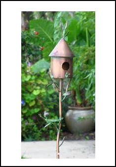
bird

{source}

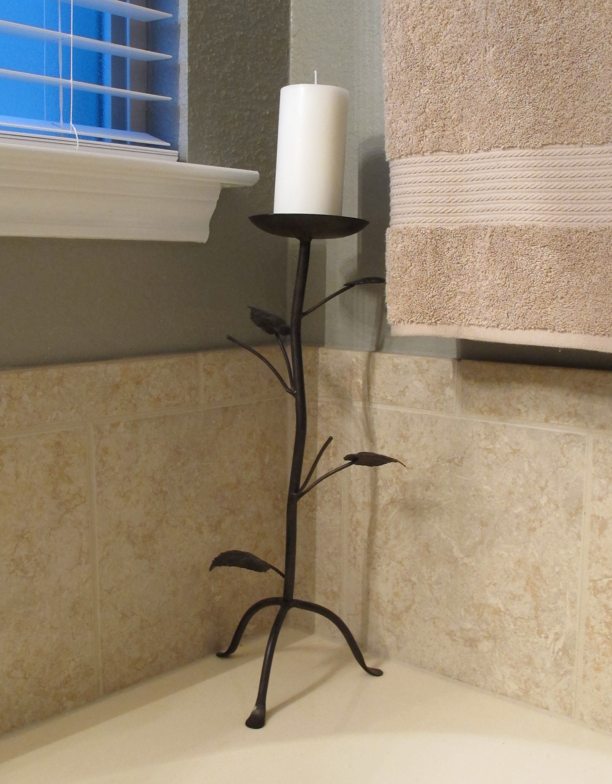
Which reminded me of this candle holder in our bathroom…

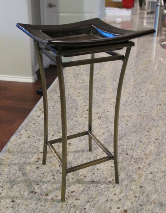
Which reminded me of this candle holder that I’d purchased in college many years ago and kept in storage ever since…

 img_5996-e1402429436584

Which totally clicked in my head as a potential birdhouse partner.

The rest of this story can really only be chalked up to fate.  It’s pretty much the only explanation.  I removed the square ceramic plate from the metal base and…


The birdhouse and candle holder fit together like they’d been separated at birth.

I simply used some Aleen’s Tacky Glue and adhered the birdhouse to the candle holder.   Once it was dry, I ceremoniously paraded him to his new home.   And here’s my little man’s masterpiece in action…

IMG_6017

IMG_6069
IMG_6044

 IMG_60512

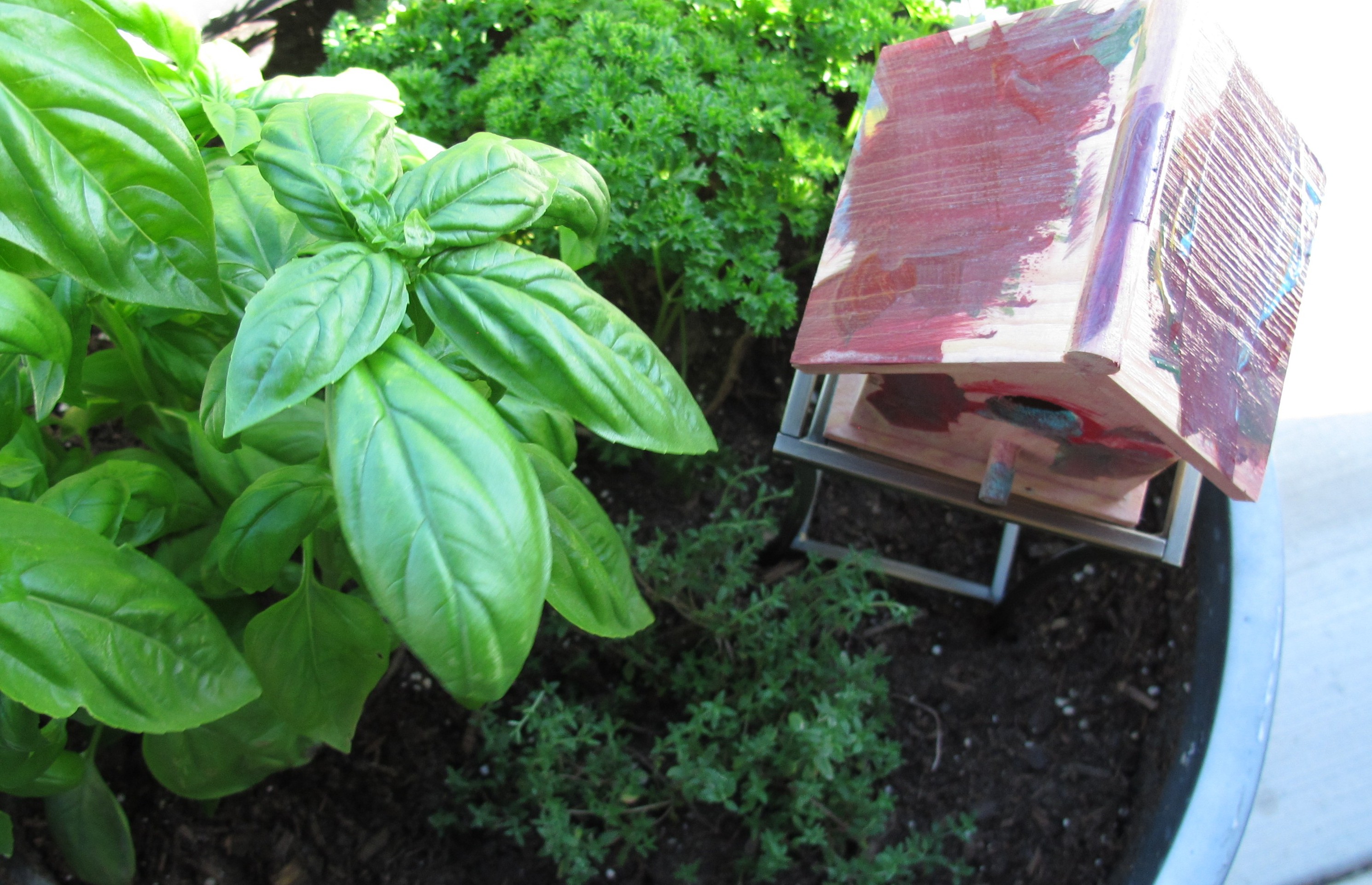
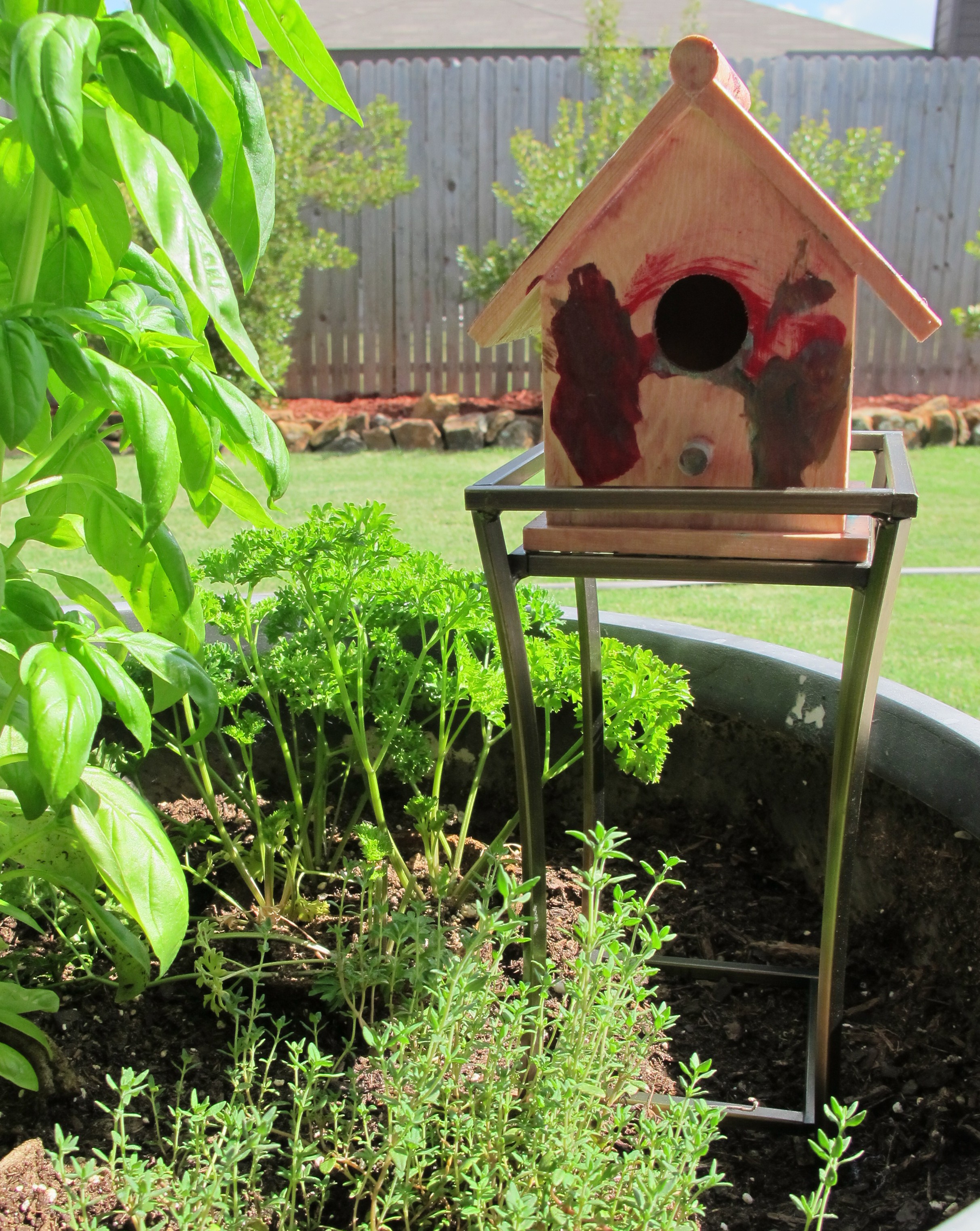
That is, my little man’s masterpiece in action next to my basil TREE!   Seriously, remember when my basil looked like this a few weeks ago????

IMG_5749

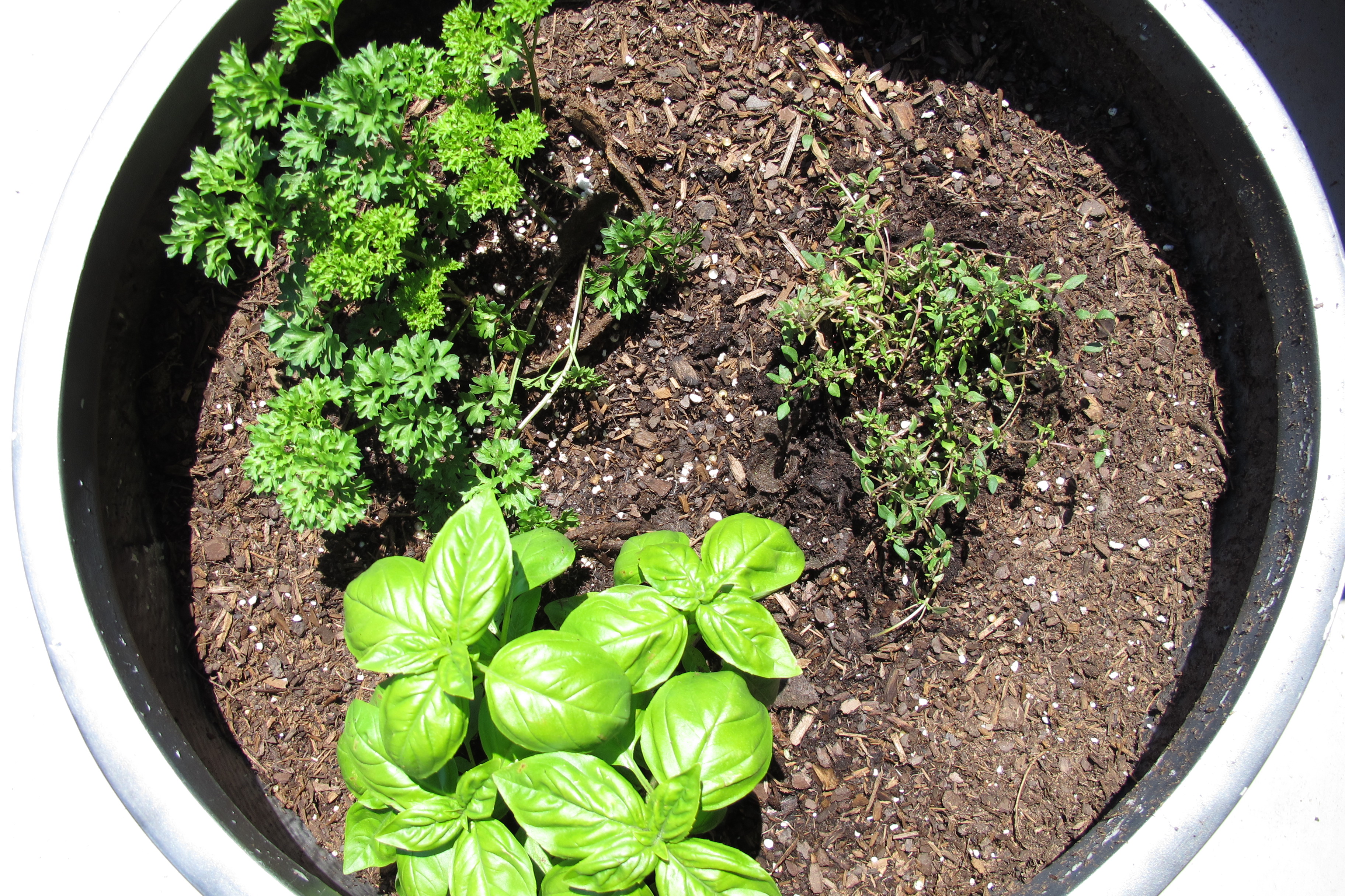
Jeepers creepers!   I’m not used to plants flourishing.  It makes me think I’m doing something wrong.

So, anyways, thus concludes the harrowing tale of how a birdhouse and candle holder found love. And how our backyard got a little more beautiful courtesy of Lucas.  🙂

Like this post??  Share it or join me on Facebook or Instagram!  

Linking up at: City of Creative Dreams, Tatertots & Jello, Lines Across, I Should Be Mopping The Floor, Tip Junkie, Upcycled Treasures
Put A Bird On It

The DIY Dreamer
TDC Before and After

Alphabetically speaking…

Howdy, all!!    It’s been a while since I’ve posted about our front room.  Last we left off, it looked like this…

IMG_2379

Now, don’t get me wrong, the room looked fine… But, it’s located right off of our foyer.   And as our foyer makeover commenced and the space became increasingly lighter and brighter (the most recent pic is in this post), the front room seemed so much darker and more drab in comparison.   Honestly, I blamed Art.   He’s the artwork above our Friheten sofa (…whose name, coincidentally, is Fri… I know. My talent for naming things is not to be matched.). Anyhoo, Art felt a little heavy to me. A little dark and traditional for my taste. I picked him up for $40 at Ross about 5 years ago because he was the right scale and colors for the hallway in our last house, but honestly, I was never totally over the moon for him.

After we moved into our current home, and our front room went from single to bi- to tri-functional, I stuck Art over the couch.  The space needed something and I already owned him (ie: he was free), so I figured it was a good “for now” solution.  I’ve always had it in mind, though, that I wanted to change Art in some way.  I’ve tossed around a few ideas over the years, but was never really sold on anything in particular.   Then, one fateful day several weeks ago, I found this picture on Pinterest…

{Source}

I think these are actually wood letters mounted to the wall, but I loved the typography.  The angular letters that all fit together.  The asymmetrical arrangement of it.  THIS is what I wanted to do with Art.

Now, I’ll just start by saying that a MUCH simpler way of transferring the image would be copy it onto a transparency and use a projector to transfer the print.  I, however, am impatient.  And didn’t feel like taking the time to track that stuff down, so I just freehanded it with my iPad by my side as reference.   I used a ruler and a piece of chalk for the straight lines…

IMG_5962 …and this bowl… IMG_5961

…for the outside of the round letters.   I freehanded the inside of the round letters and any other roundish letter that wasn’t a perfect “O”.  Like the B, P, S, etc.

About halfway through, I realized that I wasn’t going to have room for the “Y” and “Z”, but after a preliminary quick sketch of the rest of the letters, I decided that I liked it that way.  It was almost as if the letters were melting off the page.

IMG_6036

When my chalk outline was complete (totally picturing an old-movie crime scene right now), I moved on to painting.  I used some Clark & Kensington paint + primer in ultra white that I had in the garage and followed my chalk lines with a small brush and a tiny ruler that just happened to fit inside my letters perfectly…

IMG_6070

…then I used a slightly larger brush to fill between the letters…

 IMG_6059

I decided to carry the letters off the side of the canvas to further add to the “melting” illusion…

IMG_6074

This is after one coat of paint….

 IMG_6071

At this point, I grabbed a damp paper towel and wiped off all the chalk just to be sure that there weren’t any other areas requiring paint touch-up…

IMG_6072

Cleaning off the chalk made such a difference!  The letters looked crisper and more defined than I realized they would.   And thus began the unrequited crush I now have on my new/old friend Art. Once, I collected myself, I CAREFULLY applied a second coat of white paint.  And here’s the final (totally-exciting-to-me) result….

IMG_6077

IMG_6122

IMG_6099

IMG_6107

 This next shot is kind of a dark, crummy photo, but I wanted to show you guys the differences in sheen.   The flat white paint really allows the metallic sheen of the letters pop…

IMG_6105

Art really brightens up the space now and adds such nice crisp, modern feel.  I love the graphic nature of the painting, plus the mottled colors within each letter now pop and highlight the colorful accents throughout the room. I’ve got some other ideas for brightening the space as well… but *clue*…  I’ll have to see how my mid-century tables turn out before I have a concrete plan.  I worked on the coffee table some this weekend, so hopefully I’ll have an update for ya’ll soon.

But back to Art, this entire project was free for me since I already owned the canvas, paint, chalk, etc. I’m so happy that I decided to devote the time to completing this.  I would say that this project probably took me about 5-6 cumulative hours total. And it was totally worth every second (and every ridonculous knot in my shoulders after the hours spent craning over my sprawling letters). So tell me, do you guys have any random art laying around that you’ve considered altering?

Like this post??  Share it or join me on Facebook or Instagram!  

Linked up at:I Heart Organizing, Home Stories A to Z, DIY Show Off, Home ComingCity of Creative Dreams, Tatertots & Jello, Elizabeth Joan Designs, Lines Across, I Should Be Mopping The Floor, Tip Junkie, Upcycled Treasures

The DIY Dreamer
Put A Bird On It
TDC Before and After